My description of abstract
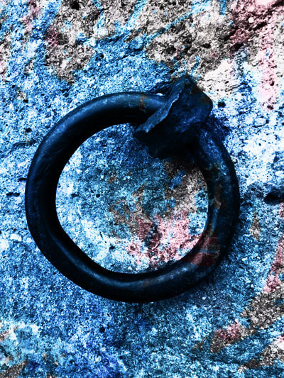
I would say abstract in art and photography is something different and weird in its own way, its something that nobody has done before, a picture or art work focused/framed on anything, something indistinguishable and that you cant tell what it is instantly. Abstract in art is art that does not attempt to represent an accurate depiction of a visual reality but instead use shapes, colours, forms and gestural marks to achieve its effect.
The formal elements
Photographers are usually aware of the ways in which they can create interest in their images beyond the simple fact of the subject. This is what separates good pictures and bad pictures of the same thing. The following list describes some of the abstract elements in any photograph. Below the list is an example of how you can analyse a photograph looking for these things specifically and how this helps to give the image meaning:
Focus: Which areas appear clearest or sharpest in the photograph? Which do not?
Light: Which areas of the photograph are brightest? Are there any shadows? Does the photograph allow you to guess the time of day? Is the light natural or artificial? Harsh or soft? Reflected or direct?
Line: Are there objects in the photograph that act as lines? Are they straight, curvy, thin, thick? Do the lines create direction in the photograph? Do they outline? Do the lines show movement or energy?
Repetition: Are there any objects, shapes or lines which repeat and create a pattern?
Shape: Do you see geometric (straight edged) or organic (curvy) shapes? Which are they?
Space: Is there depth to the photograph or does it seem shallow? What creates this appearance? Are there important negative (empty) spaces in addition to positive (solid) spaces? Is there depth created by spatial illusions i.e. perspective?
Texture: If you could touch the surface of the photograph how would it feel? How do the objects in the picture look like they would feel?
Value/Tone: Is there a range of tones from dark to light? Where is the darkest value? Where is the lightest?
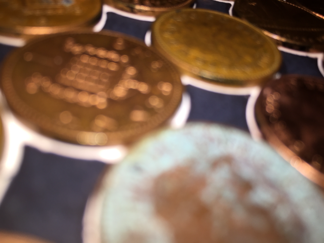
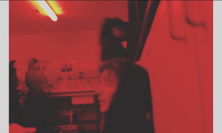
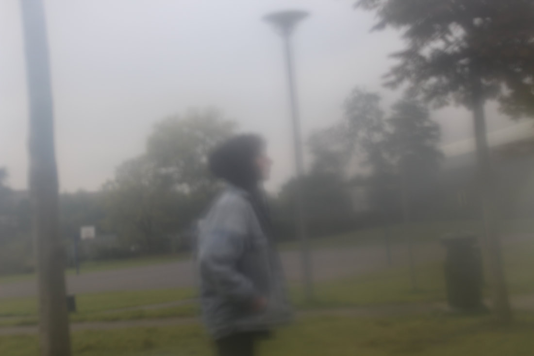
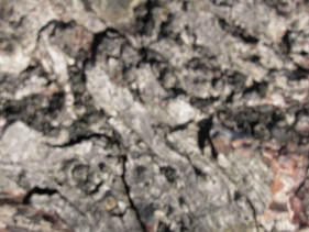
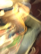
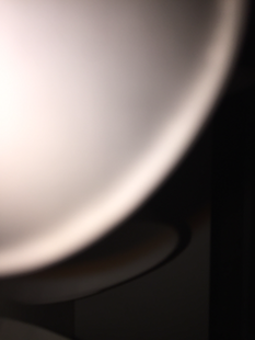
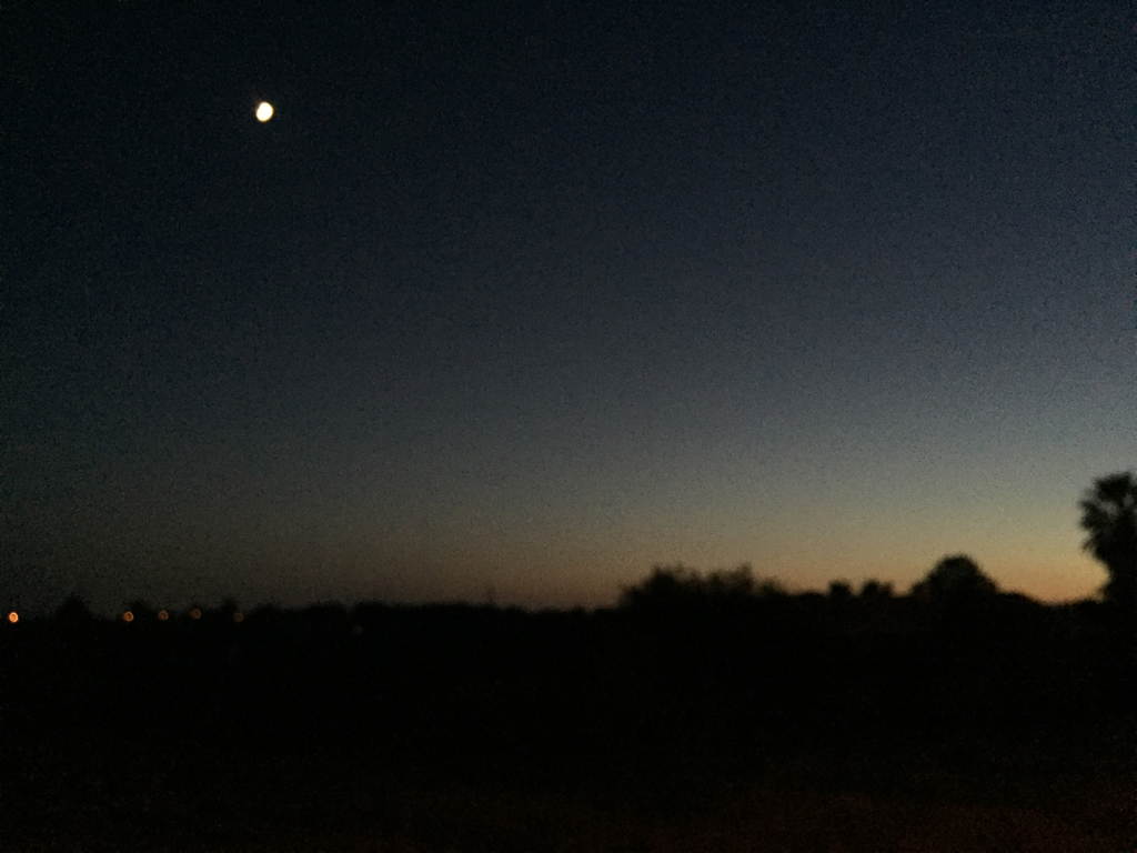
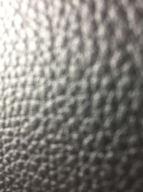
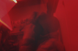
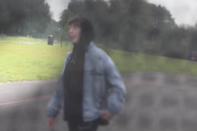
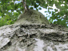
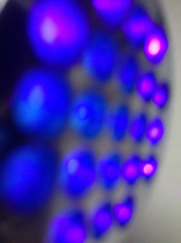
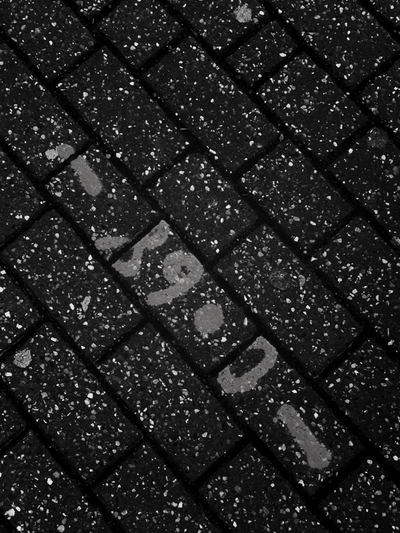
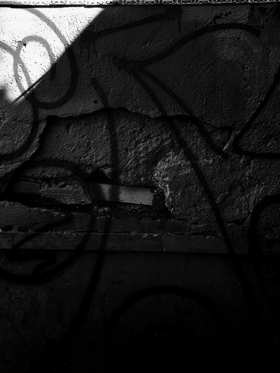
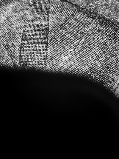
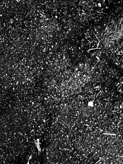
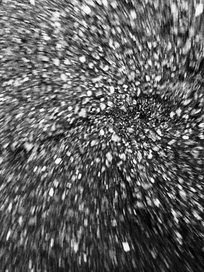
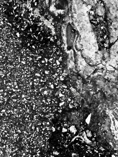
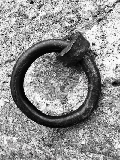
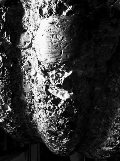
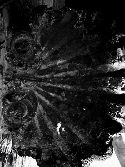
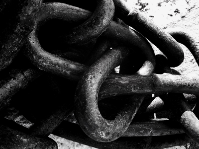
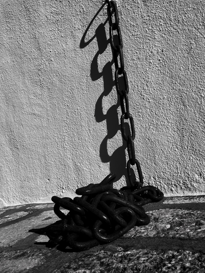
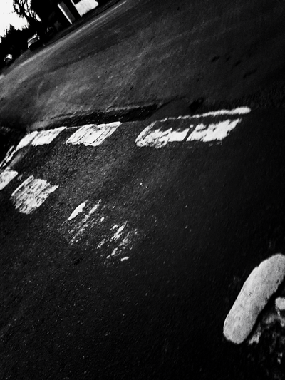
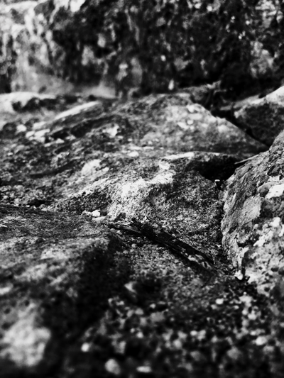
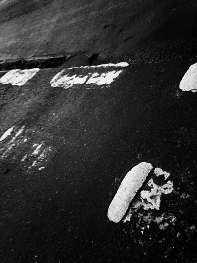
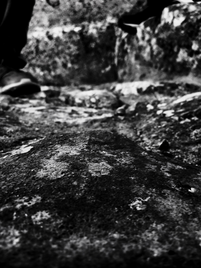
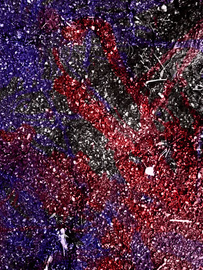
Half term abstractions homework
I have taken quite a lot of pictures in and out of school for the halfterm homework and some of them are better than others but in my opinion they are all quite abstract of course and here they are. I have also done some photograms at school but i was not able to scan them last lesson because I was sick and I had to leave early but here is what I have so far.
|
|
|
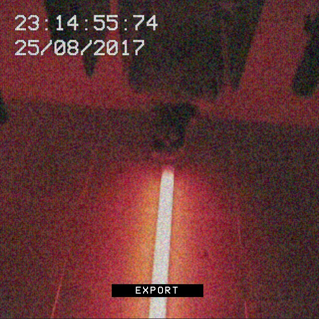
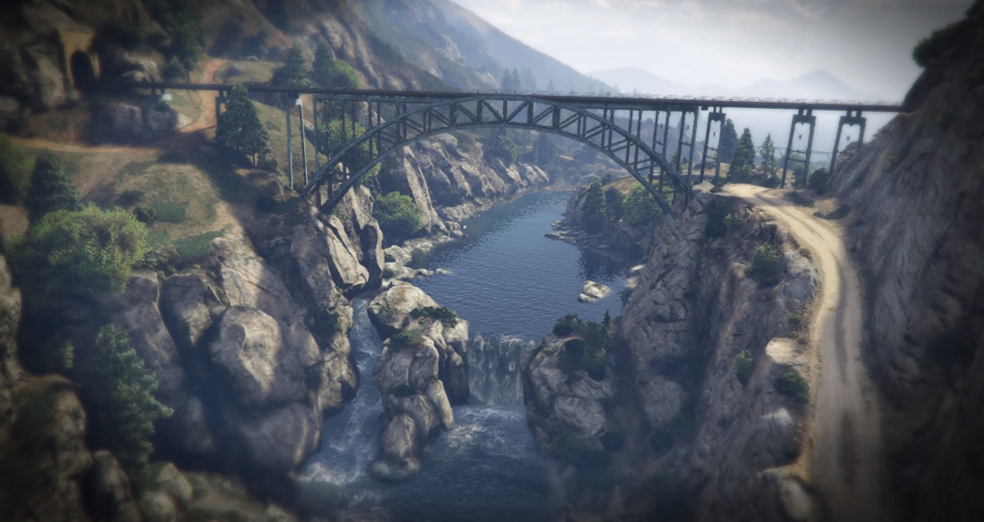
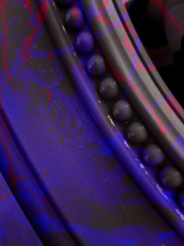
In-Game photographs - half term homework
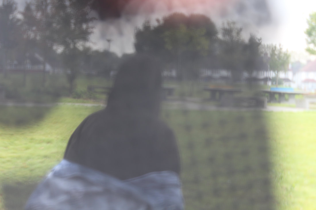
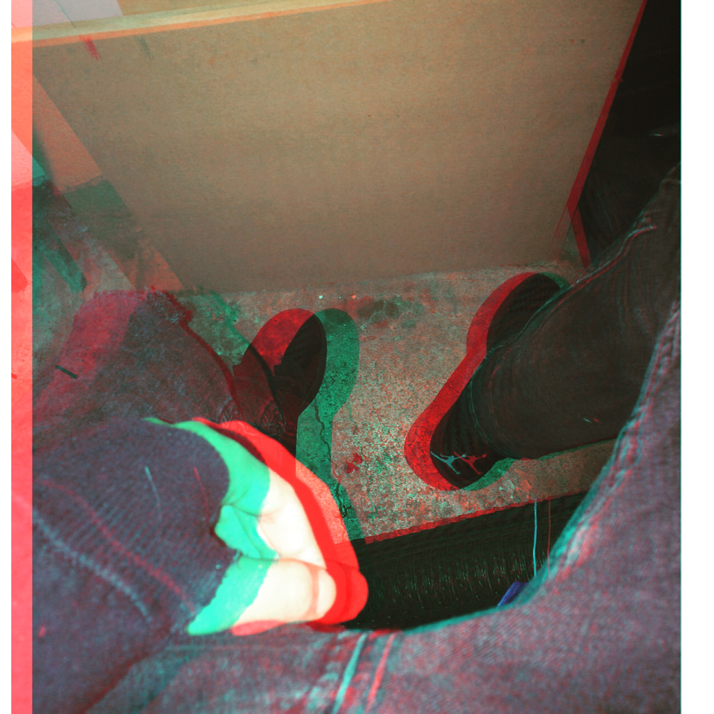
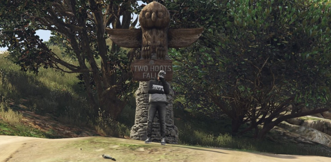
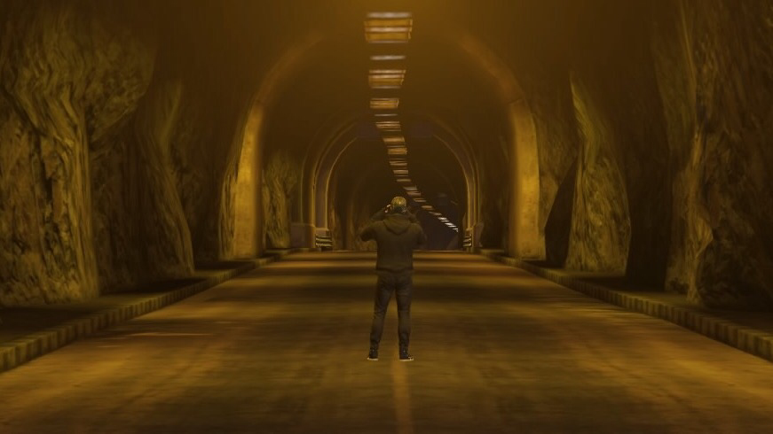
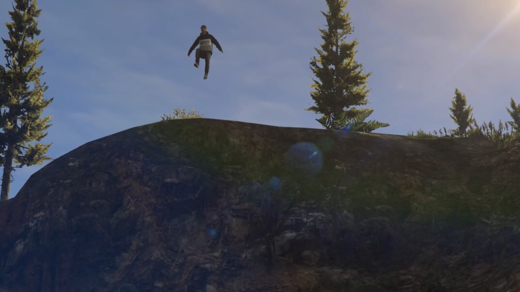
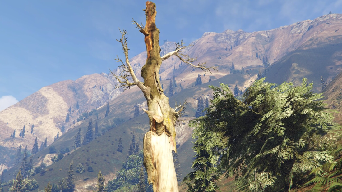
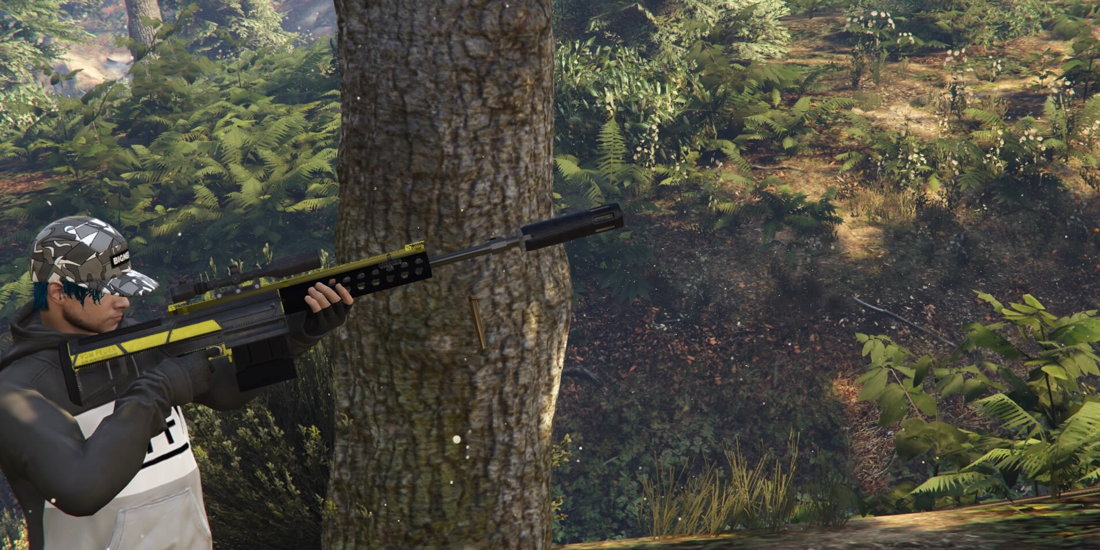
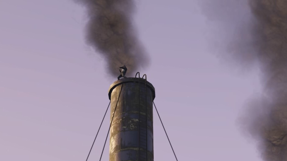
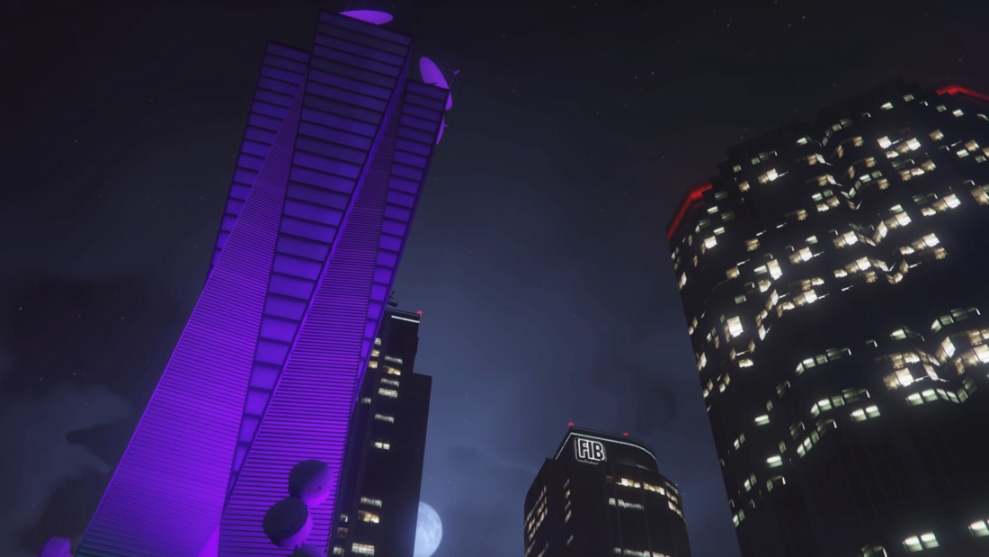
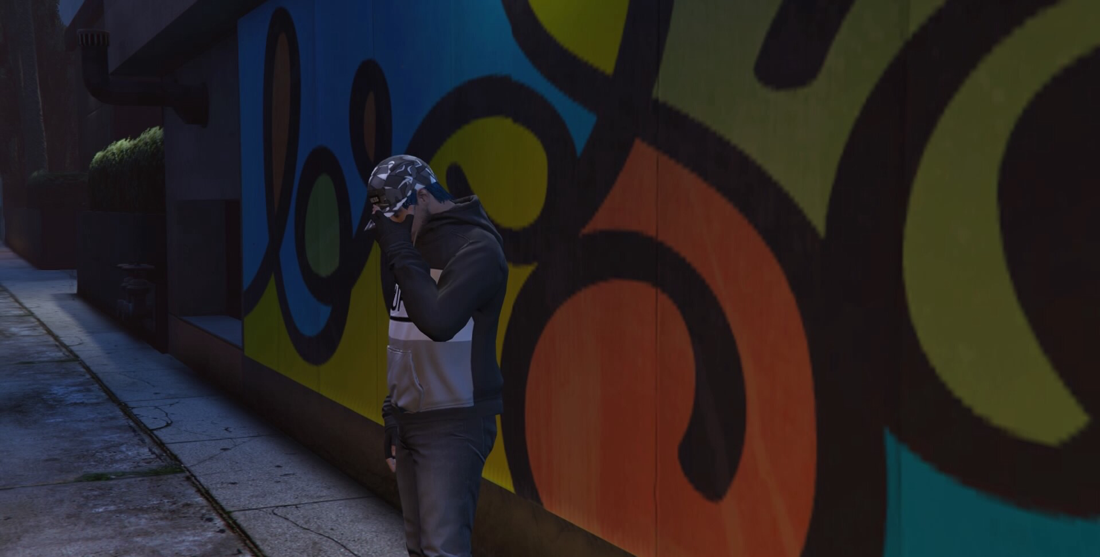
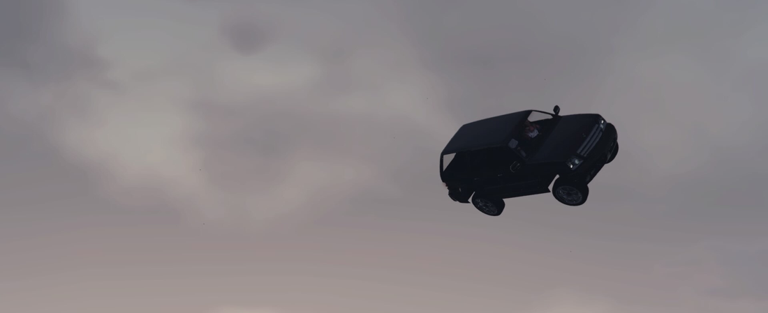
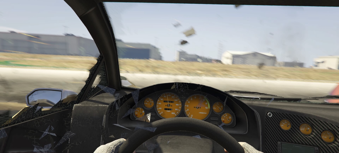
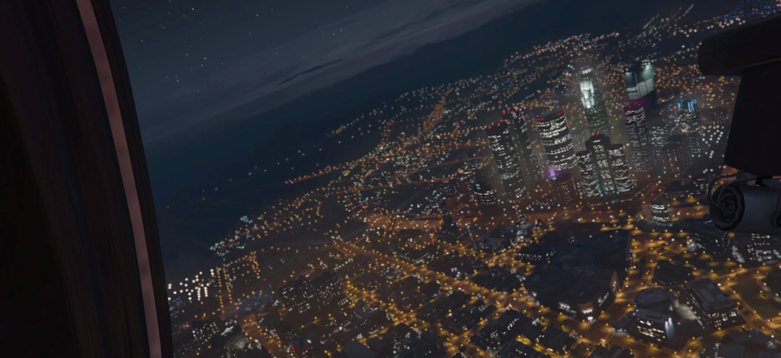
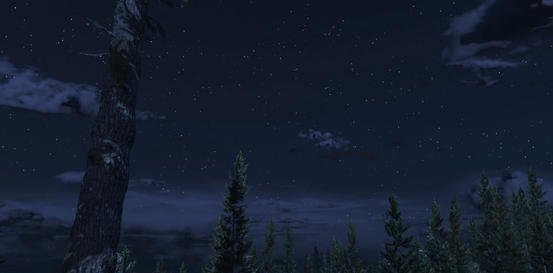
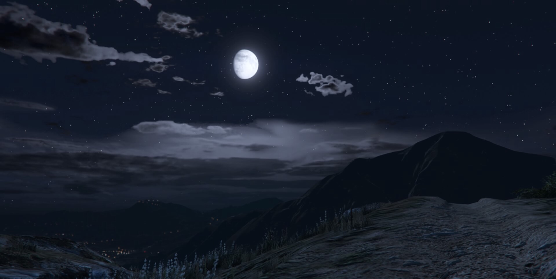
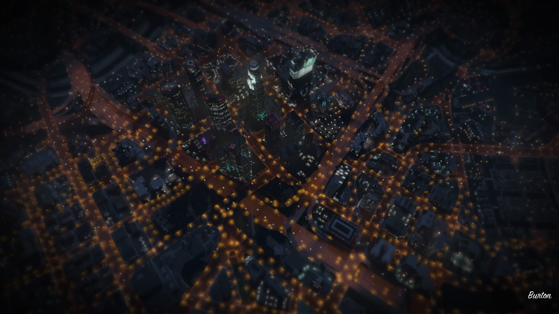
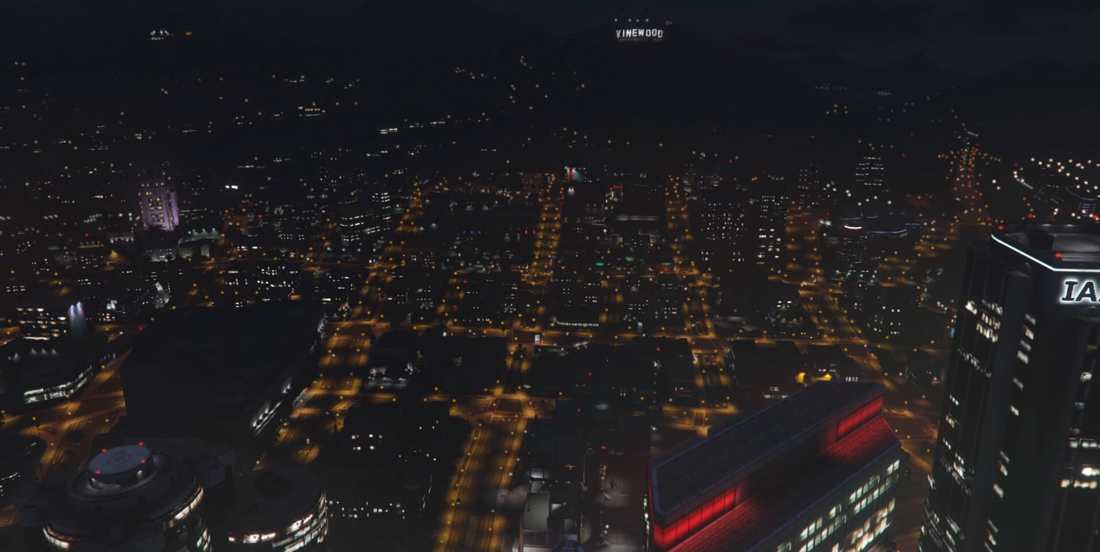
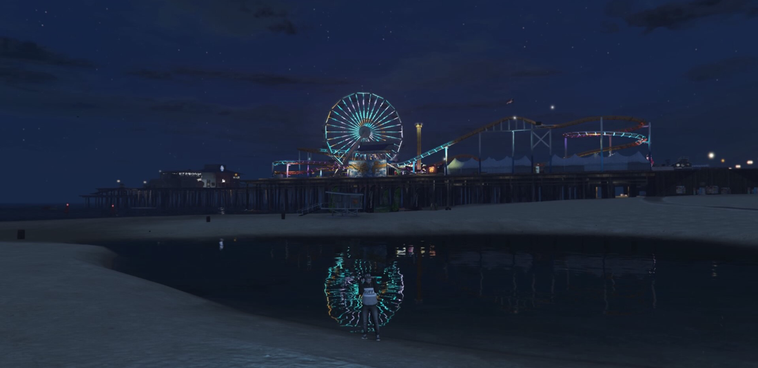
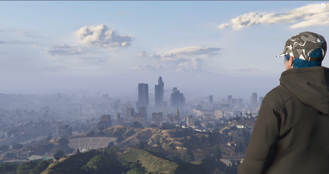
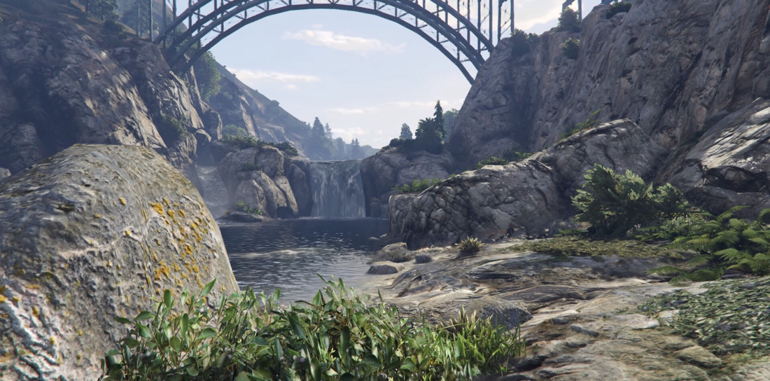
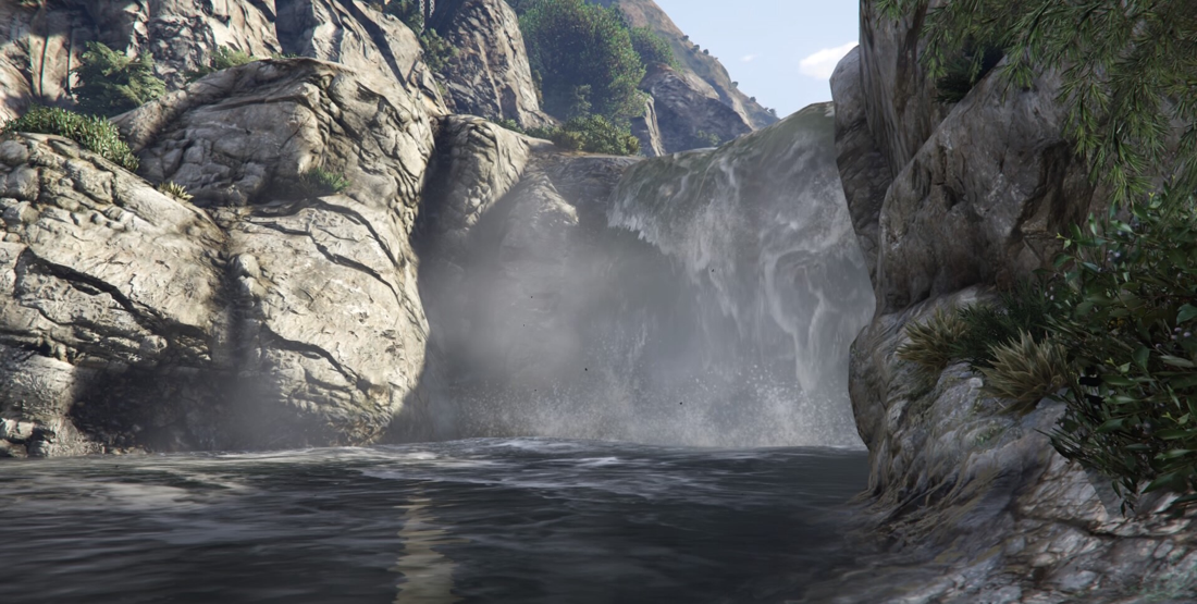
I also had the idea of pictures in a video game instead of images in the outside world, I have taken quite a few but I think that these images count as abstract in my opinion, abstract is something different that hasn't been seen and something that you cant distinguish what it is so I think this counts as "abstract". All of these pictures were taken at home in the world of Grand Theft Auto 5 which is like a recreation of LA so I had a whole city, literally, to explore and take interesting photos from it and it turned out better than I expected it to, writing this is making me seem like a complete nerd... I don't know if I will use some of these pictures for the final piece of the homework but if I still have space for these then I will for sure use some of them.

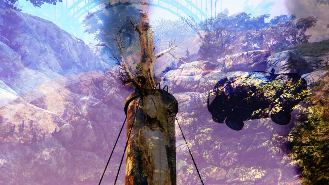
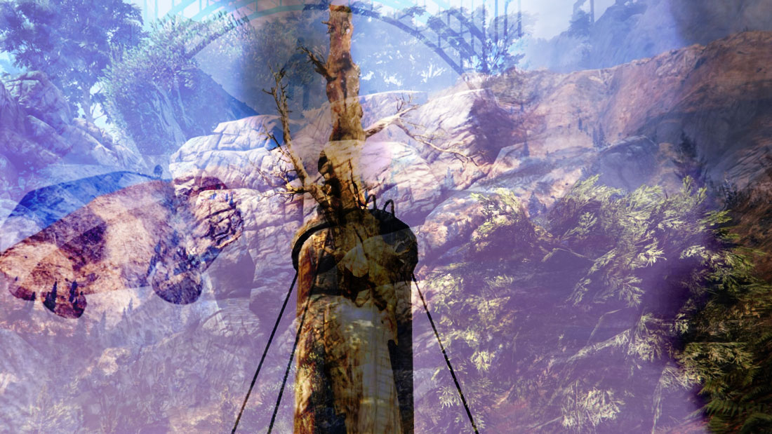
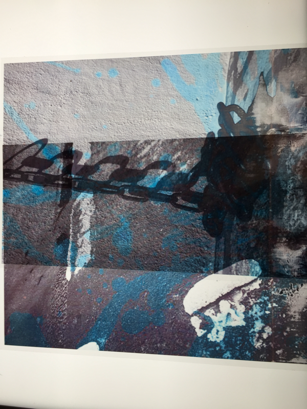
TAking it a step further
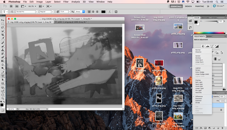
I put some of the lighter photographs that I took in game onto photoshop and I overlaid the photos and added different filters to it and with multiple photos and I made one single abstract photo.
|
|
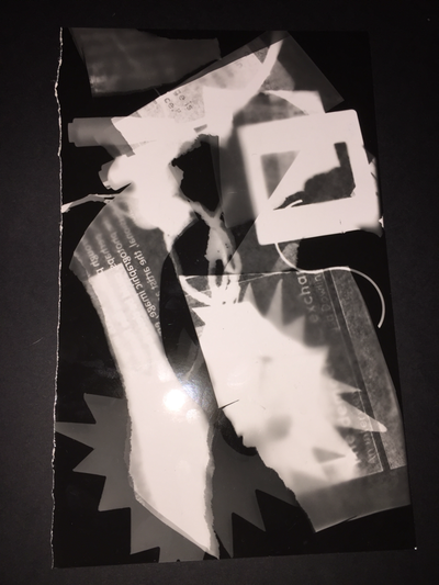
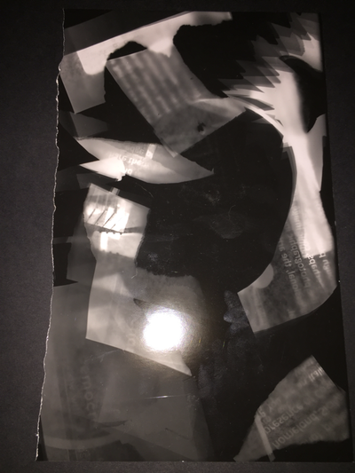
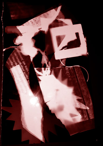
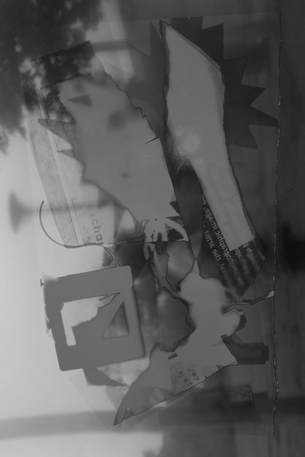
Schadographs
I was inspired by christian Schad 's schadographs and I decided to create my own, it took a while for me to get the hang of creating these abstract photograms but after trying and trying it turned out pretty well, here are my two best ones. I could of probably done more but I didn't have enough time to do more and creative schadographs since I made these after school but when I have more time I will try to improve and make better looking ones.
|
|
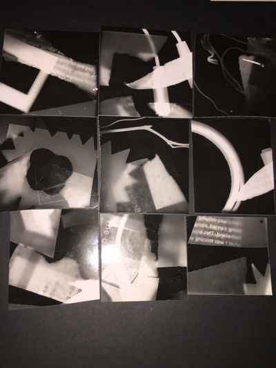
After making those "normal schadographs" I had the idea to make something original and even more abstract, I found these tiny square pieces of paper and i turned 9 of them into their own mini schadograph. These pieces all join up together in any way you would like and I made them exactly like I made the normal sized schadographs, here are two examples of my schadograph jigsaw.

|
|
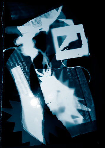
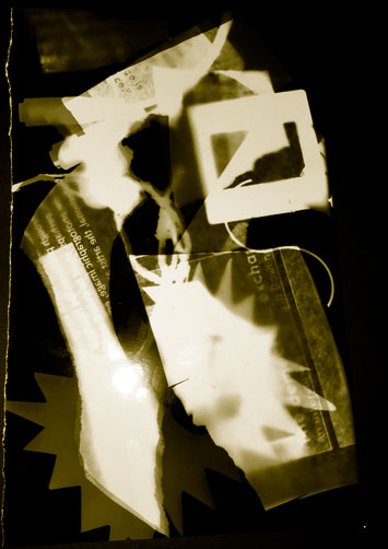
DUotones
How to create a duotone:
- Alter contrast using Image > Adjustments > LevelsDrag the Black and white sliders towards the centre of the histogram
- Crop the image using the Rectangular Marquee Tool > Image > Crop
- Select Duotone from the Image > Mode menu
- Select Duotone again from the drop down menu and your second colour. Name it and click OK
- Save your image for the web (Save for web) and select jpeg at maximum size.
|
|
|
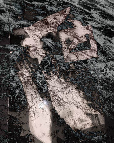
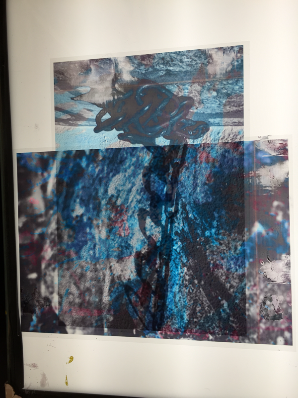
Overlayed images
|
|
|
|
Year 10 Abstraction Assessment - Masahisa fukase
For this half of the assessment I am researching an artist that I have recently learnt about and I became very interested in his work, Masahisa Fukase. I have been drawn to his work especially his two books "Ravens" and "Hibi". On both of these books Fukase focused on one thing and they are all pictures that you cant tell what they are instantly and some of them are almost indistinguishable . His pictures do not represent an accurate depiction of life, its almost like he created his own world in his own books.
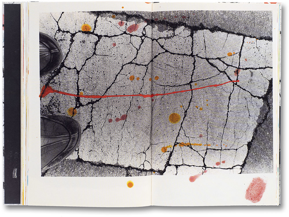
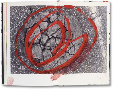
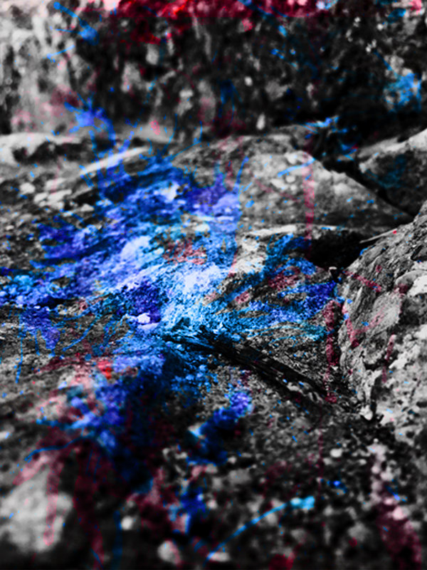
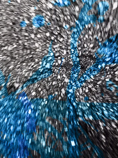
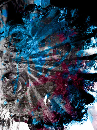
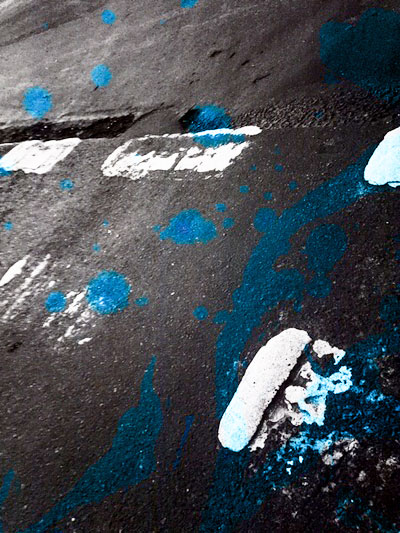
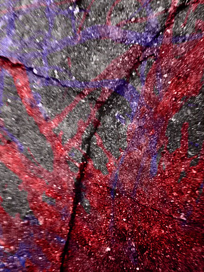
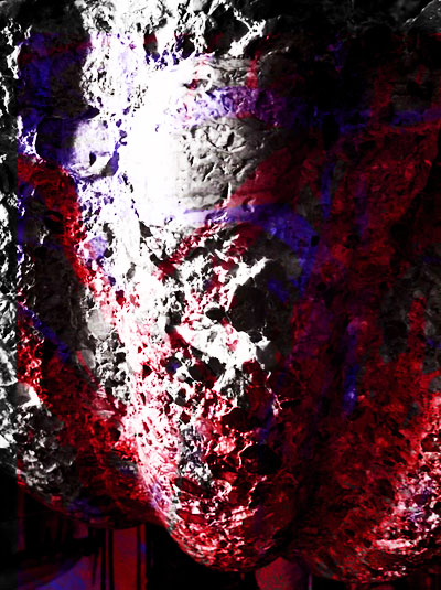
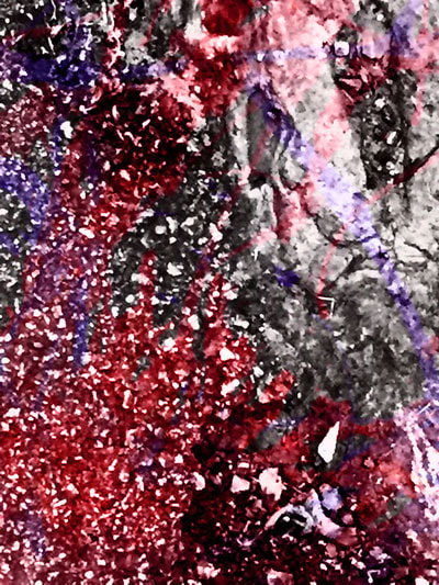
On the photo book "Hibi" Fukase focused on street pavements and floors with cracks and framed them all differently and printed them in the darkroom in black and white, he then manually edited them by adding drops of paint and ink to the pictures to make them his own perspective of life. The paint and ink make the pictures contrasting and makes them stand out more and more interesting, those pictures without the paint would be dull. Additionally Fukase also added in some of the images his own finger prints with ink to make his work "his" because nobody else could copy his fingerprints, those are his pictures, his work and they are completely different to what I've seen.
On his other photo book that I'm focusing on "Ravens" Fukase focused on the world around him, the people in it and obviously Ravens, again all of the pictures in this book are black and white. This book is focused on Fukase's preoccupation with his motif all throughout his work. It was a reflection of his angst throughout his life and he identified himself artistically as a raven and eventually he went mad " Fukase became the singular raven frozen by his camera and immortalized on the cover of his most famous book." Ultimately Fukase was taking pictures of how he saw himself, as a Raven that is solitary and lost so these pictures aren't just random pictures that he decided to take and make a book out of it, this book depicts Fukase's emotions at the time and how he thought of himself.
|
|
In the book "Hiba" Fukase frames cracks on the concrete and printed them in the darkroom and afterwards adding paint on to the physical images. The pictures itself are already digitally abstract in the first place but by adding paint on the physical images it gives it another hint of abstraction, the paint not only attracts the human eye but it makes the picture become contrasting and more pleasing to look at. Additionally the paint gives the artist the opportunity to add his own mark into the picture to show that its his, Fukase does so by using his own finger print to put his own mark on the piece, making it again, physically abstract.
I am interested in making a set of photographs exploring the idea of, patterns, texture, framing and colour based on the pictures taken by Masahisa Fukase from both photo books "Ravens" and "Hiba".
I am interested in making a set of photographs exploring the idea of, patterns, texture, framing and colour based on the pictures taken by Masahisa Fukase from both photo books "Ravens" and "Hiba".
pICTURES FOR hIBa

Final hiba pictures
I took the pictures separately from the actual paint patterns which made the work a bit longer and more difficult to do. I ad to scan the paint patterns then put the patterns and the original image onto photoshop , overlay them, change the brightness and the colour so the patterns stand out more than the black and white creating the contrast from Fukase's original pictures. I was originally thinking of creating a photo book like Fukase did but instead now I think I'm going to present the pictures on a wall. I didn't use all of the pictures that I took to make final pieces because some of the pictures were too dark and editing them made the picture look weird and the colours would become too bright and they wouldn't be visible and thats not what I want, the colours need to brighter than the black and white pictures to create the contrast.

Acetate hibi images
I picked the best pictures from hibi in my opinion and printed them on acetate and put them on the lightbox because they are a little transparent meaning that if I put one of the pictures over another one it will combine them in a way creating other multiple pieces.

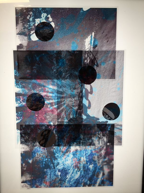
final piece
For the final piece I cut circles in the original images of hibi and put them on top of the stacked acetate images that together made an interesting final piece. Originally I wasn't supposed to have this as my final piece, I had the idea of, like Fukase, to create two booklets of the two types of pictures i created, the ravens inspired images and the hibi images. However this would of been too similar to what Fukase did so I had to make something different and original and so I experimented printing the images onto acetate and I thought it looked really good so I made this my final piece.

Dafna Talmor
Dafna growing up did a lot of moving around places and travelling but she always took her camera with her because it was a way to keep memories of every place she has been to with her to the point that she had piles of boxes filled with photos that she was not satisfied with that were neglected from any artistic function. However what she thought was initially the idea of frustration and disappointment led to the idea of creating and joining different places with a certain personal meaning to create an "idealised and utopian landscapes" She describes constructed landscapes as 'Constructed Landscapes transforms colour negatives of landscapes initially taken as mere keepsakes through the act of slicing and splicing. The resulting photographs allude to an imaginary place, idealised spaces or as Foucault states, “a virtual space that opens up behind the surface”. '
Photographic History
One artist that did similar work to Dafna's constructive landscapes work was Gustave Le Gray. One of Le Gray's images was The Great Wave. He took a picture on the Mediterranean coast near Montpellier. At the horizon the clouds are cut off where they meet the sea. This indicates the join between two separate negatives. The combination of two negatives allowed Le Gray to achieve tonal balance between sea and sky on the final print making it similar to Dafna's constructive landscapes pieces because they are both made of two separate images or more joined together to make one singular image.
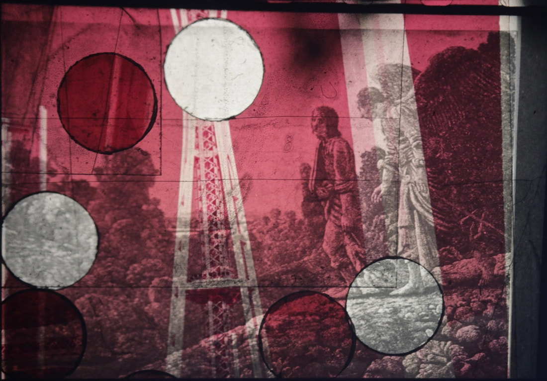
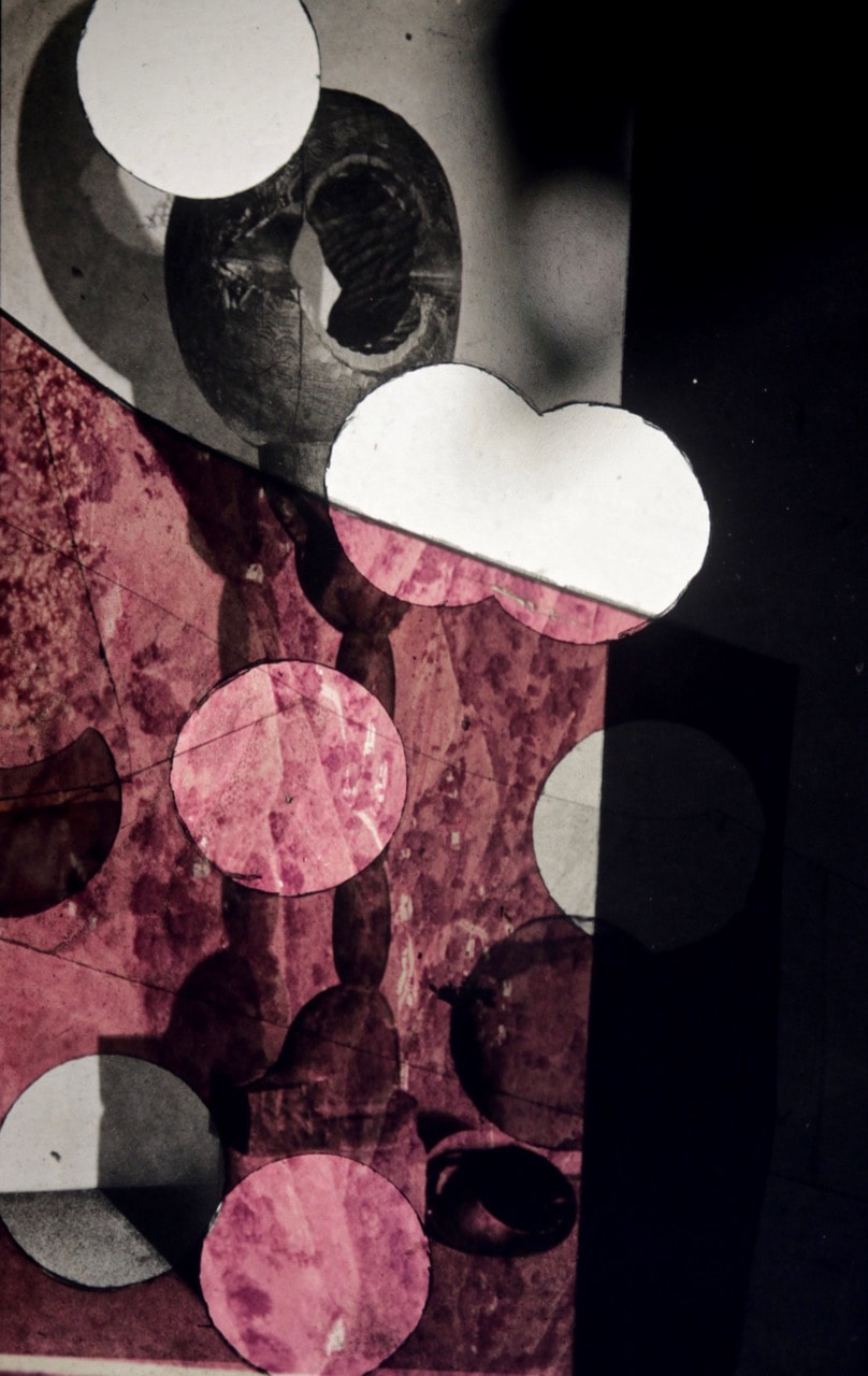
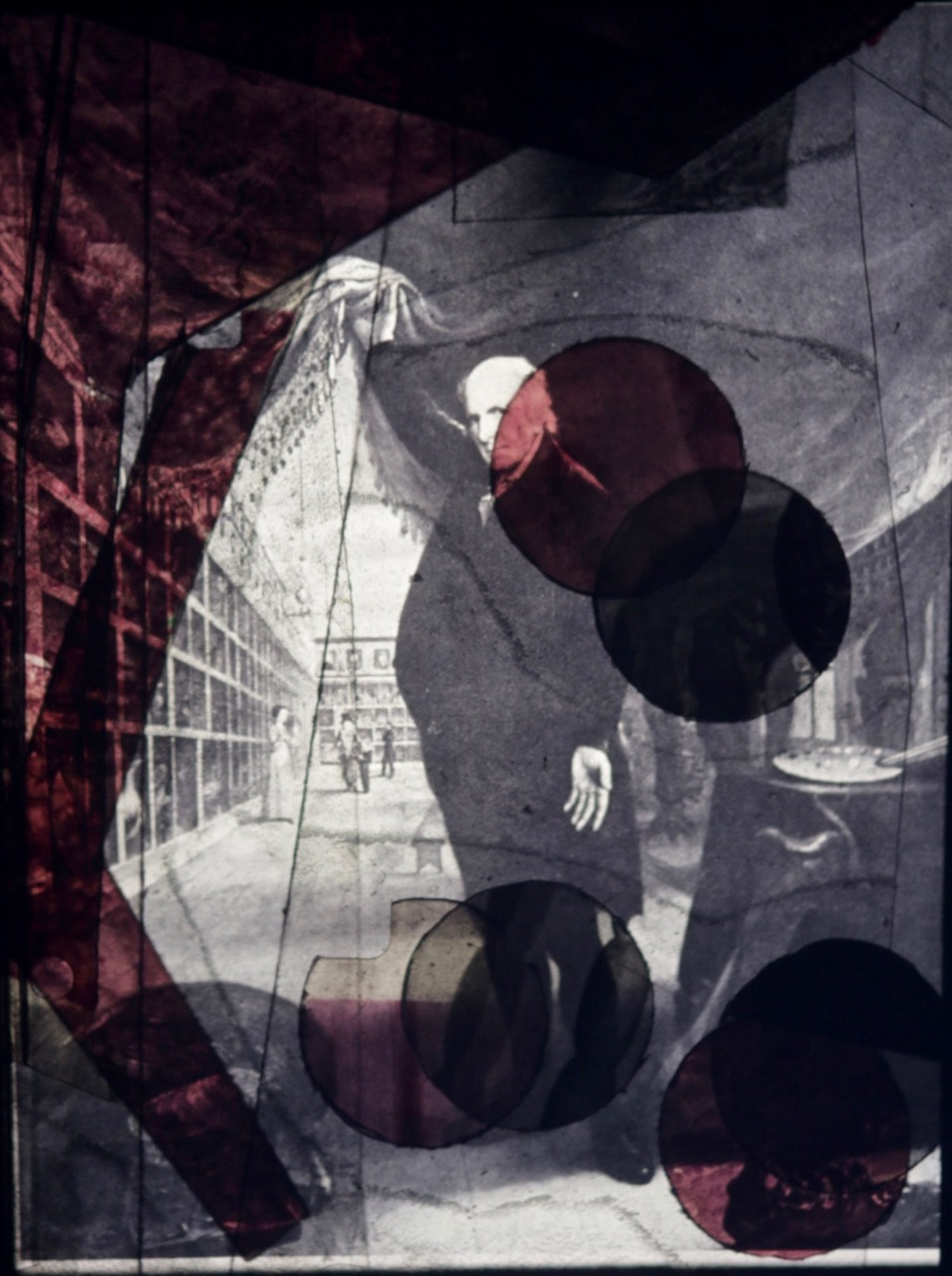
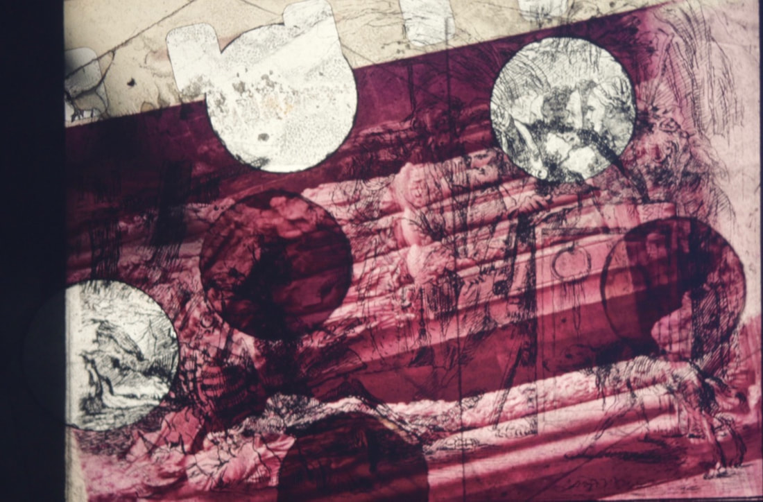
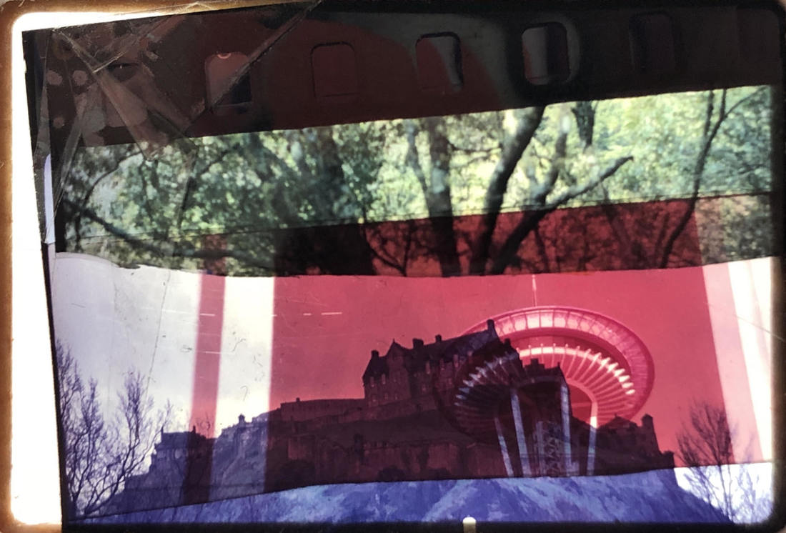
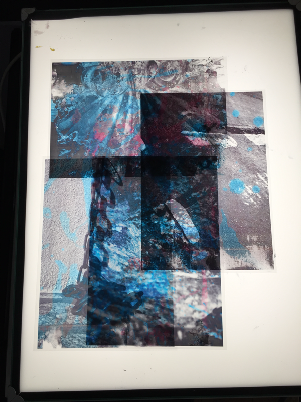
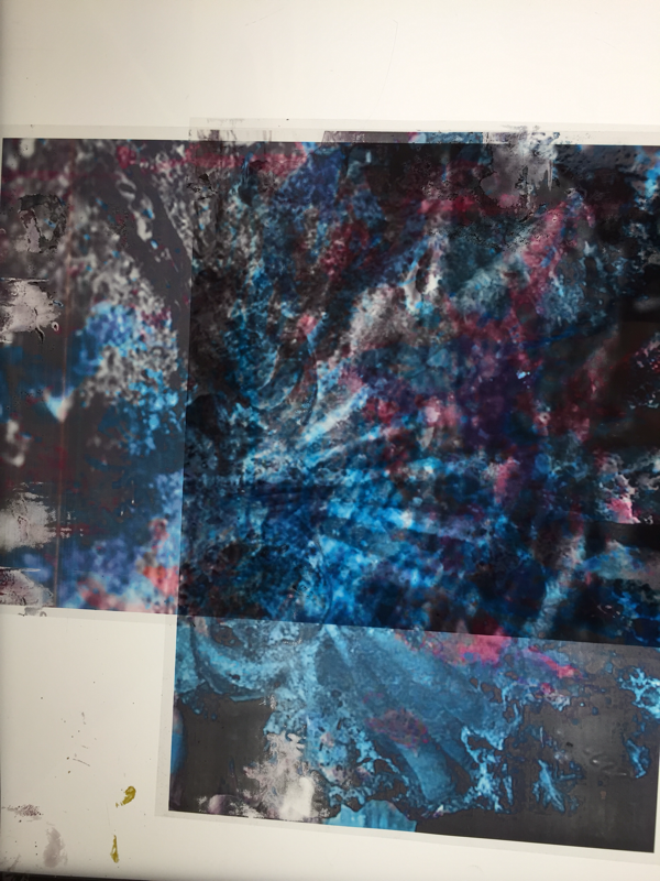
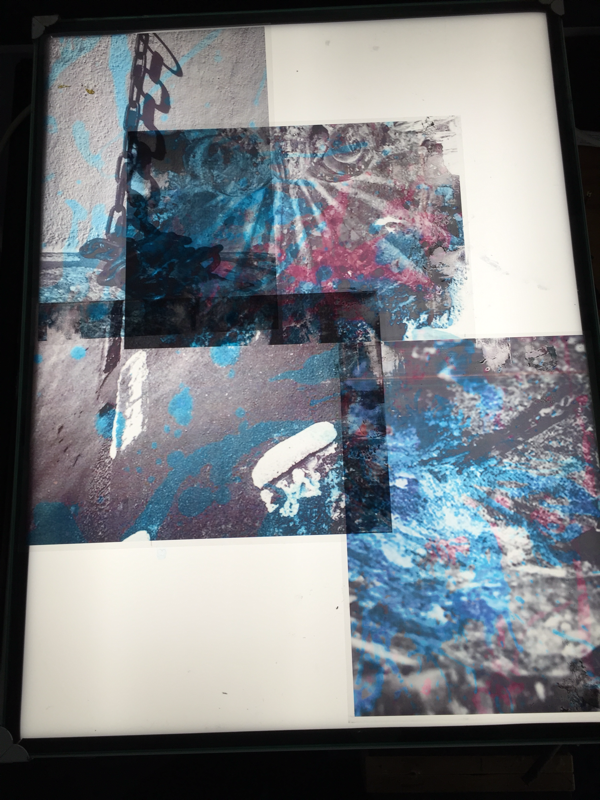
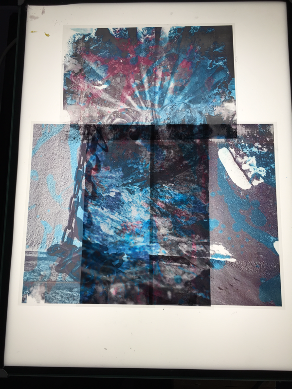
The workshop
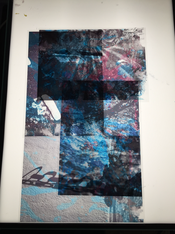
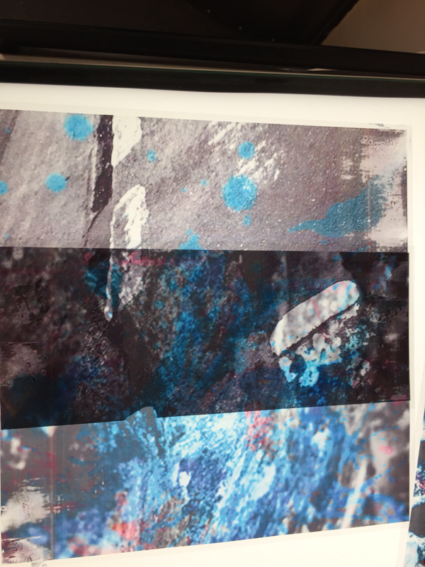
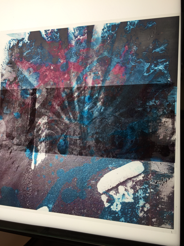
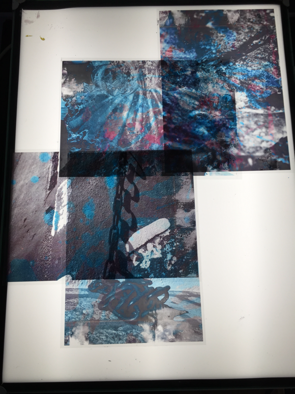
Our class was recently given the opportunity to work in a workshop set up by Dafna Talmor and Mr Nicholls
in where we were able to create our own constructed landscapes that we made with multiple different slides by cutting them, painting them, placing them on top of each other to make a completely different and more interesting image taking inspiration from Dafna's constructive landscapes series.
Photographic History
One artist that did similar work to Dafna's constructive landscapes work was Gustave Le Gray. One of Le Gray's images was The Great Wave. He took a picture on the Mediterranean coast near Montpellier. At the horizon the clouds are cut off where they meet the sea. This indicates the join between two separate negatives. The combination of two negatives allowed Le Gray to achieve tonal balance between sea and sky on the final print making it similar to Dafna's constructive landscapes pieces because they are both made of two separate images or more joined together to make one singular image.
The workshop
Our class was recently given the opportunity to work in a workshop set up by Dafna Talmor and Mr Nicholls
in where we were able to create our own constructed landscapes that we made with multiple different slides by cutting them, painting them, placing them on top of each other to make a completely different and more interesting image taking inspiration from Dafna's constructive landscapes series.