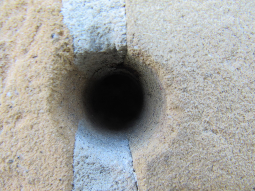
Definition of openings
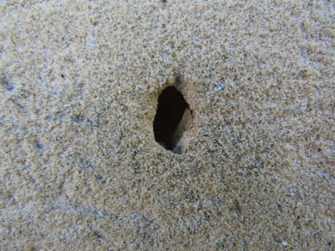
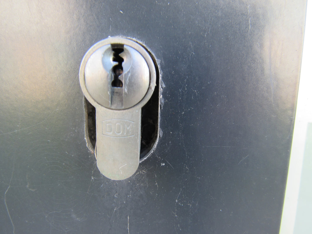
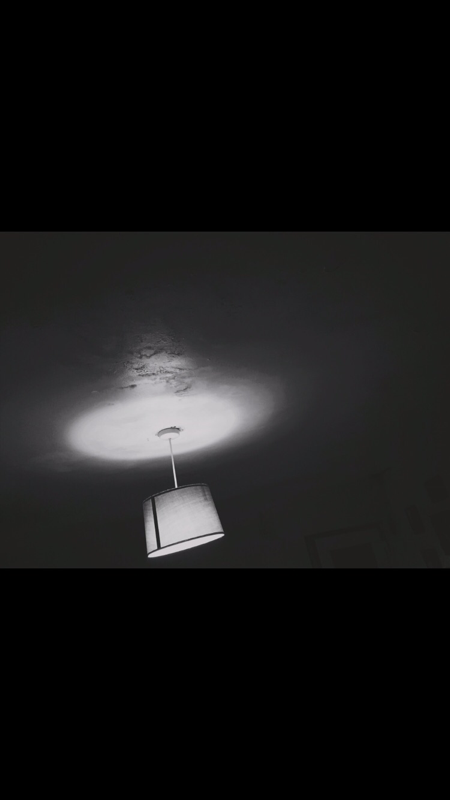
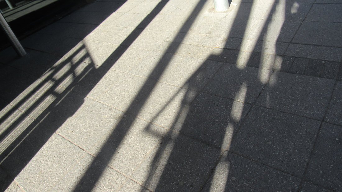
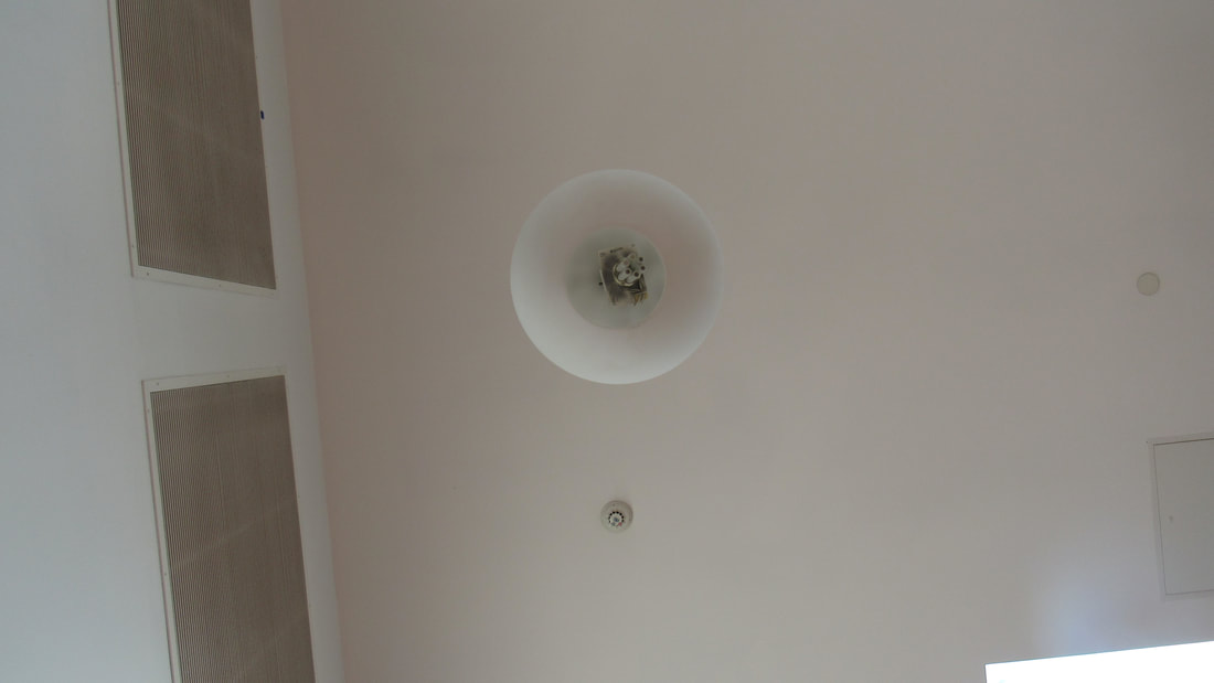
An opening is a space or a gap which allows passage or access to someone or something, like light, hole, aperture, gap, space, cavity and beginning, all these words are different physical things, however they all mean the same, they are all an opening or a opening to a new opportunity (which is also an opening) for something great. Most openings that you see in photography are windows or doors and for some photographers they play an important part in their photos and composition. Any picture counts as a picture of an opening as light has to go through the openings of the camera to create the picture, any picture that is taken by any camera is a picture from an opening.
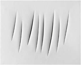
One of the photographers that was focused on openings and holes on canvas for example was Lucio Fontana. Fontana focused on making cuts on canvas to create images. He started by painting the canvas and then cut it or even sometimes made holes. The norm of art and painting on canvas is creating an image of the real world in 2D and it has been like that for centuries, however Fontana changed it all and used the canvas to create a sculpture as the cut is not 2D but 3D and it makes you question what he made.
photo shoot inspired by lucio fontana
"dEAR sTRANGER"IMAGE ANALYSIS
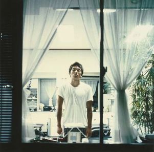
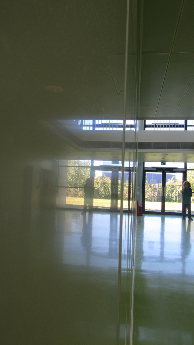
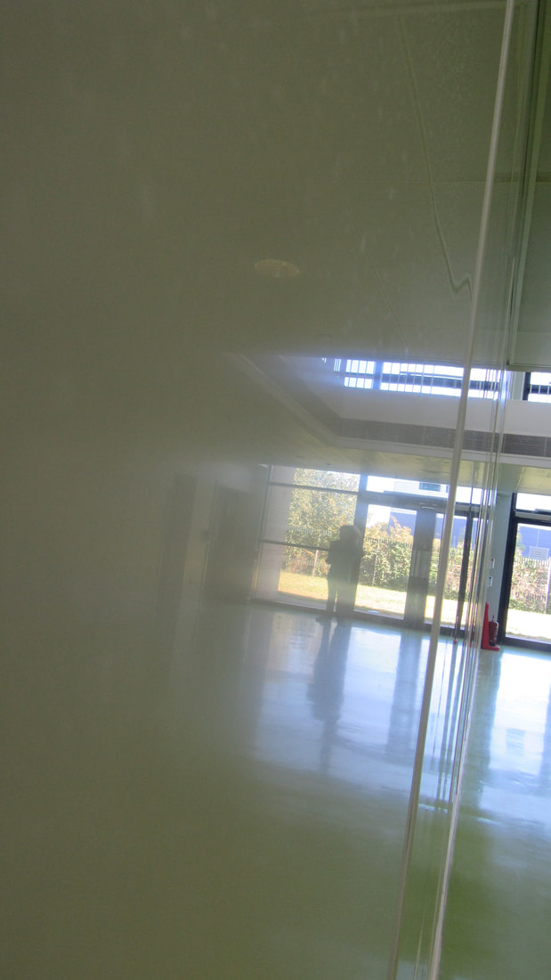
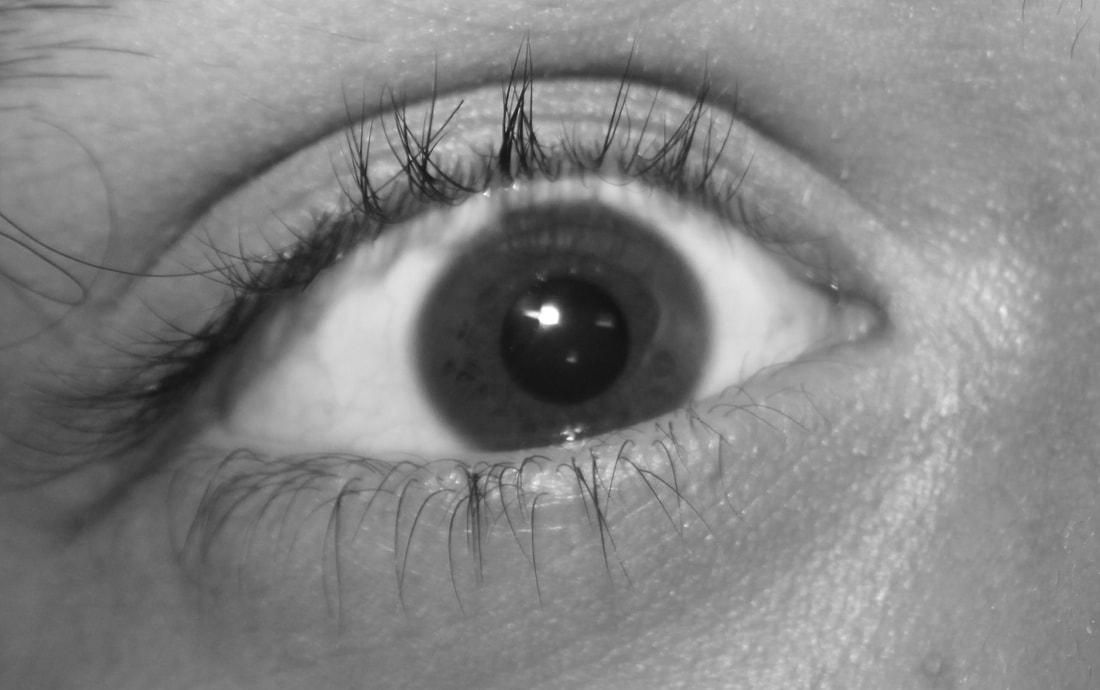
Every picture that has ever been taken was taken from an opening because, if you think about it, a camera is a machine that opens and closes and when it opens the light goes in to create the image and when its closed it doesn't and this happens because the aperture of the camera opens. We can adjust on a camera how big or small we want the aperture to be, the smaller the more focused and clear the image is and the wider the less clear the image becomes and this is also how pinhole cameras for example work. Our eyes work comparably to cameras when its dark our pupils enlarge so we can see better in the dark and when there is light the pupil contracts. Although the picture from the series "dear stranger" is through an opening (a window) the picture itself was created because of the opening of the camera it was taken with. Furthermore as the picture was taken through a window it makes you wonder, what is on the other side? And what is the man in the image looking at? Windows are this kind of opening to the beauty of the real world and it shows the reality and the freedom of the outside through a piece of glass which makes the picture more enigmatic.
Furthermore the main focus of the image I would be the man standing in the centre of the image and the focus is mainly on him. The man has a blank look in his face as if he is dead or has no soul which is contrasting to the colour of the room he's in which is white and also his t shirt which is also white and white is usually associated with life or angelical things. However white can also be thought to be the colour of nothing and dullness. Furthermore the plant on the right also represents life as it is part of nature.
The photo was taken at night outside and you can tell as the picture is taken through a window and its dark on the edges of the window, and to be able to take a successful photo at night the shutter had to be lowered so as much light would enter the camera so the picture would not be blurry but to do that he had to stand completely still for a long period of time or the picture will come out blurry and to do this he used a tripod. You can see a tripod has been used as the middle of the image is the middle of the face of the person in the image and this shows that the camera was lined up like this purposely. Furthermore for the people in the pictures of this series of photos he took to know where to be and at what time the photographer sent multiple people a letter starting every one with "hello stranger" and in a way this was a opening to creating new relationships between different people, however many of the letters sent were rejected.
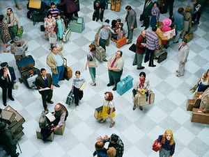
Visit to a photography gallery - Homework
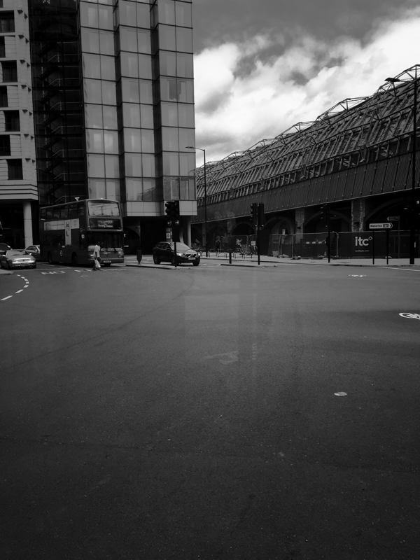
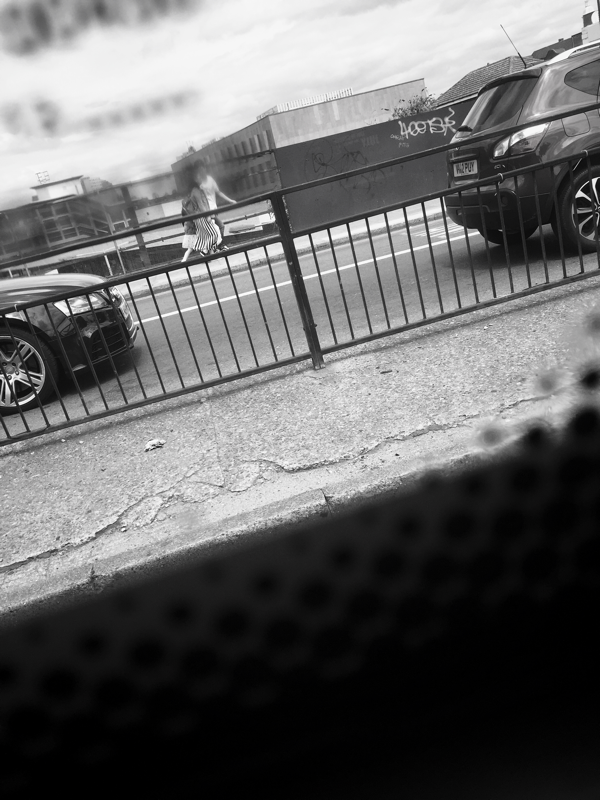
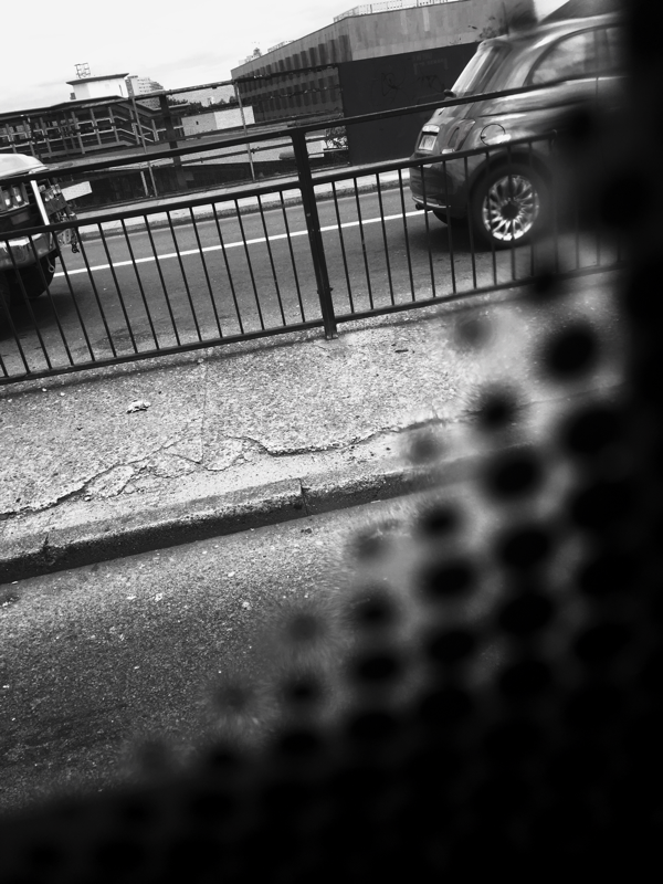
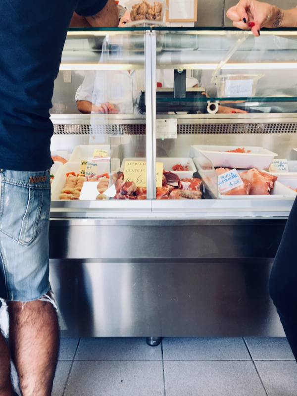
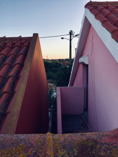
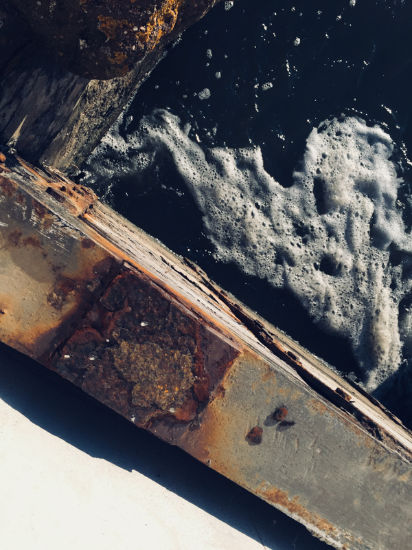
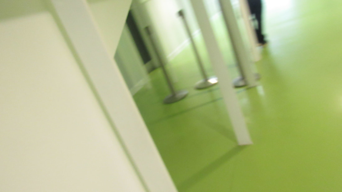
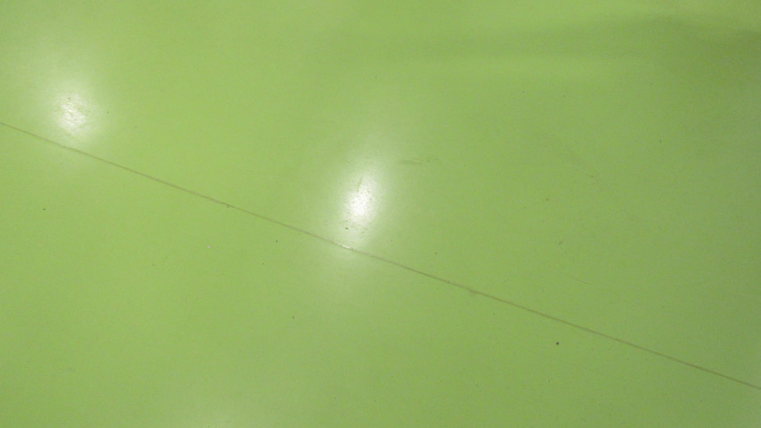
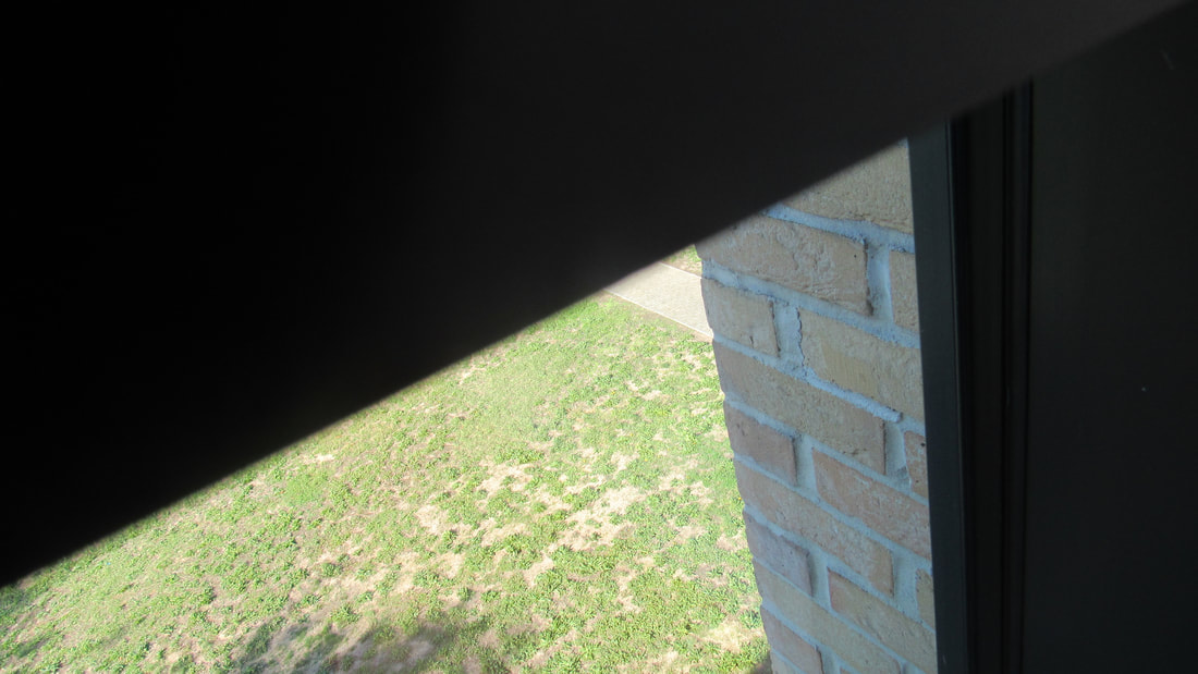
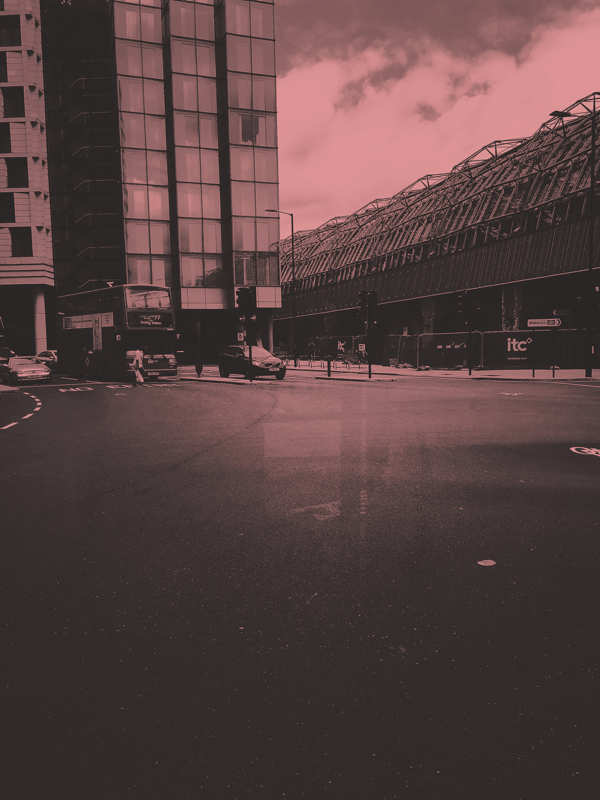
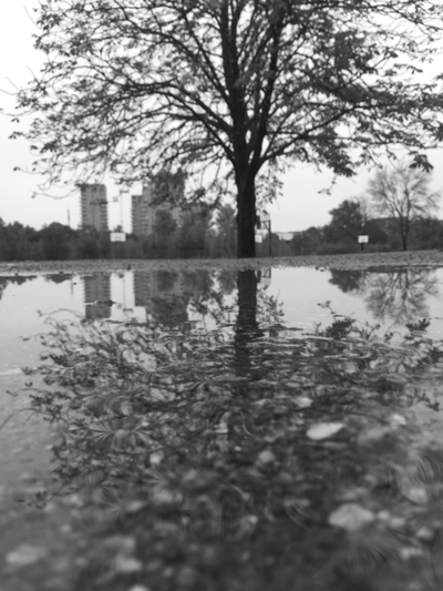
On Saturday I went out to central London and Visited a photography gallery called the "Photographers' Gallery" in London. On my way I took a few pictures of my journey and these are the most successful ones.
booklet and sticker
|
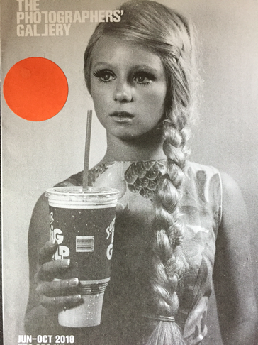
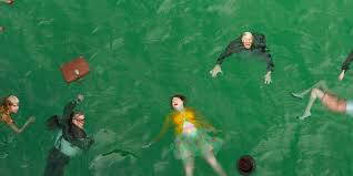
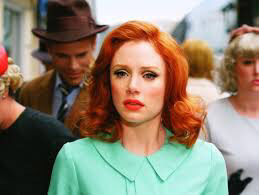
When you get to the gallery they give you an orange sticker and a booklet saying who's work is going to be shown and the sticker is so people working there know you are looking at the pieces. There were various artists in the gallery that had taken various pictures that were interesting and I got to look at some of their work. However one of the artists that caught my eye was Alex Prager as his work is usually very vibrant, bright and colourful.
|
Alex Prager
Alex Prager is an American art photographer and film maker who lives in Los Angeles. Her photographs primarily have actors, models and extras to create "meticulously designed mise en scène”, often described as film-like and unreal. Prager’s growing filmography expands the fictive realities of her still works, touching upon themes of alienation of modern life. All of Prager's pictures look like pictures that were taken watching a movie and it's almost like all of them tell you something different and tell you a story. Furthermore each of her pictures are as if a filter was put on them to make them more vibrant and almost dream like. Some of the pictures remind me of an artist that I have been looking at in my Art class, Michael Craig-Martin as he also uses similar colours in his paintings and drawings like Prager does on her pictures which attracts attention and guides your eye around the image and is a kind of guide to look at the pictures and art pieces.
Perspective
|
|
Mr Nicholls gave me the idea to watch a video about Peter Fraser, and some of the pictures that he has taken and the approach he too to take such successful images. Fraser says that it's almost like he can smell a picture and he understands the connection between the senses and photography and how they are both connected to memory and how smell can remind you of things and triggers your sub conscious to remember things from the past that you aren't really sure about, deja vu, however, pictures help to remember these distant memories that aren't clear anymore. He also looks at things that would look the same from the first glance but as you keep looking at the two things you start realising how truly different they can actually be. An example of this is a picture with two light blue buckets that are almost identical, but as you keep looking at the picture you start realising things like, the buckets are two different tones, one of the handles is plastic and the other is metal, but they are both contrasting, they are the exact same object with differentiating qualities, all you need is to look at something with fresh eyes, and you start realising the little things, and this could easily be related/connected to the theme I'm looking into of openings.
|
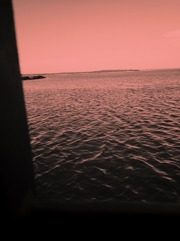
SUMMER HOLIDAY PICTURES
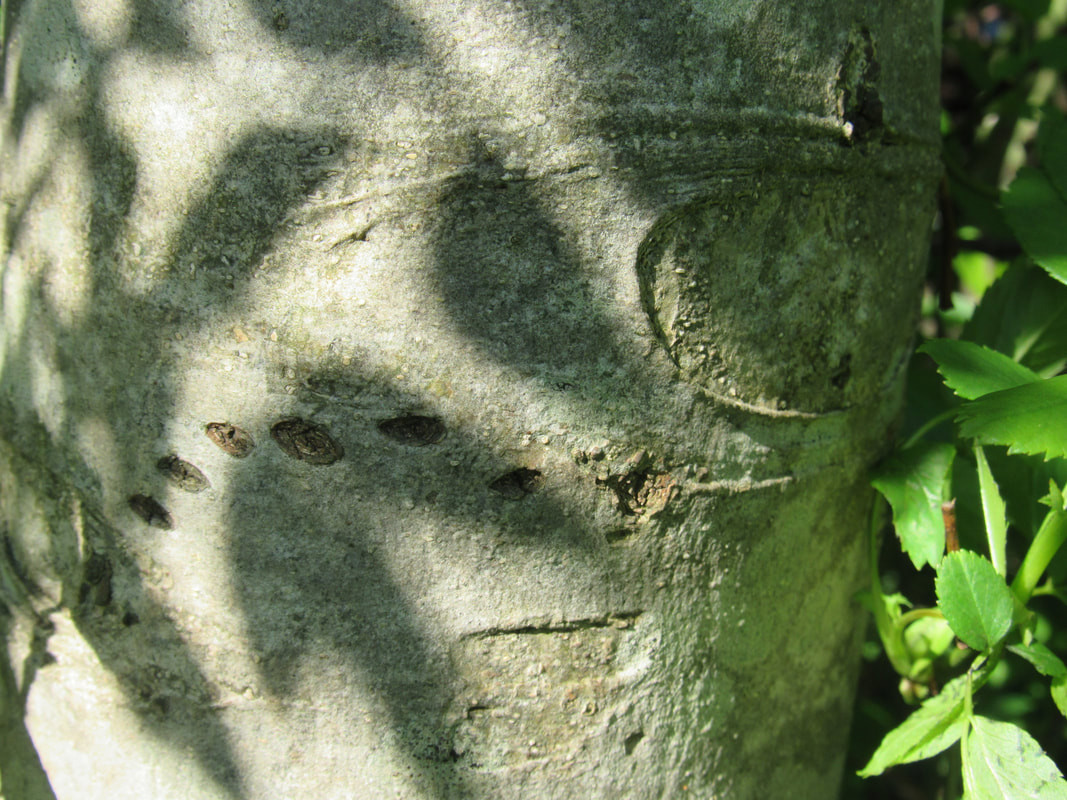
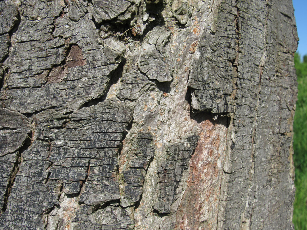
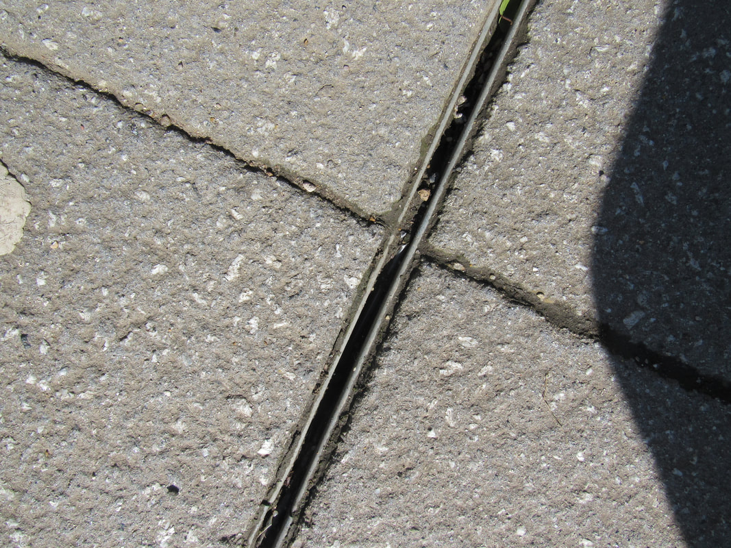
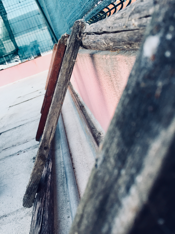
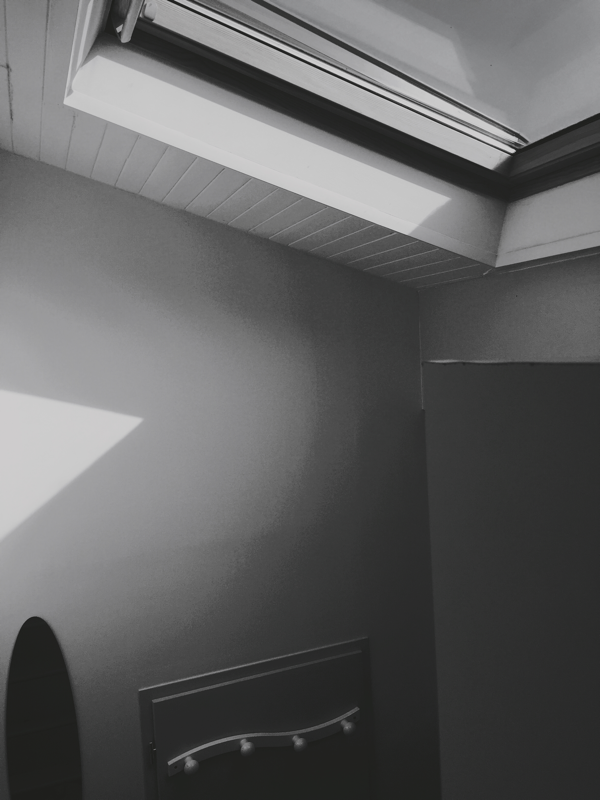
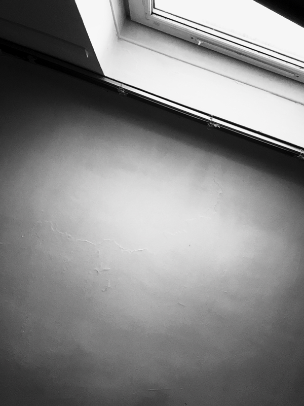
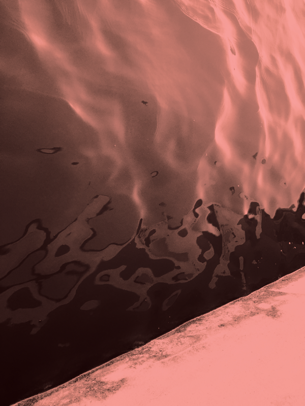
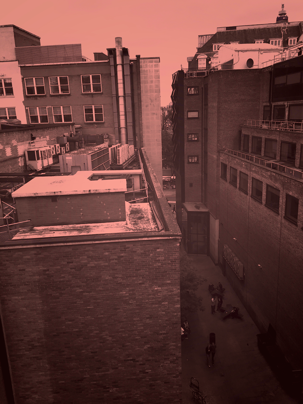
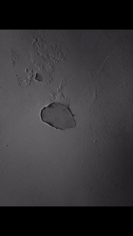
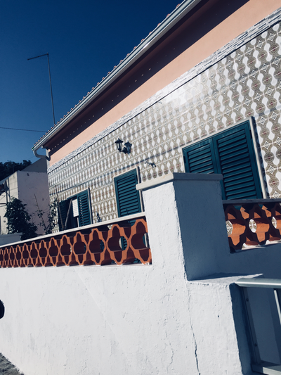
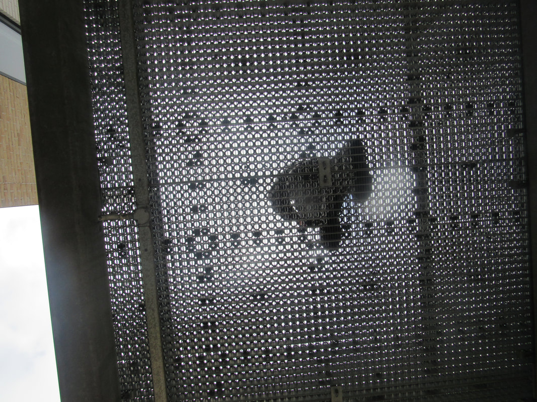
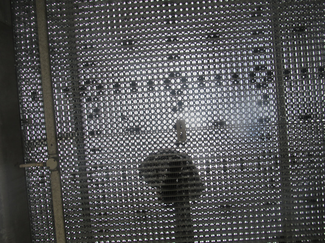
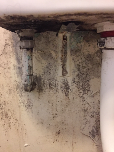
Before I went on holiday I was told to take pictures of things I see all the time, casual objects, things that I would usually see on the day to day basis, however, I was told to look at these things from a photographers perspective, looking at these things with fresh eyes, and so I did. I put this series of images into sections in a way, the red images are more abstract and they were taken in France and the UK , the black and white images were taken in Spain and the others in Portugal and most of these images are in a way connected to my theme of openings, however I am not sure what I'm going to do with them yet. I took various pictures but out of all of them these were the better ones of them all.


triptychs


diptych

Quote
'I hope that, by looking at my photographs, people will develop a better understanding of the world around them and more empathy with the people in it.'
You can interpret this in one of two ways, a photograph is an opening in the camera that allows light to enter and create an image which is an opening or by taking photographs people will have an opening for more knowledge about the world and the people in it, but also the openings of a new relationship with someone you might take a picture of which would lead into more openings and different outcomes in the future.
You can interpret this in one of two ways, a photograph is an opening in the camera that allows light to enter and create an image which is an opening or by taking photographs people will have an opening for more knowledge about the world and the people in it, but also the openings of a new relationship with someone you might take a picture of which would lead into more openings and different outcomes in the future.
Uta Barth images
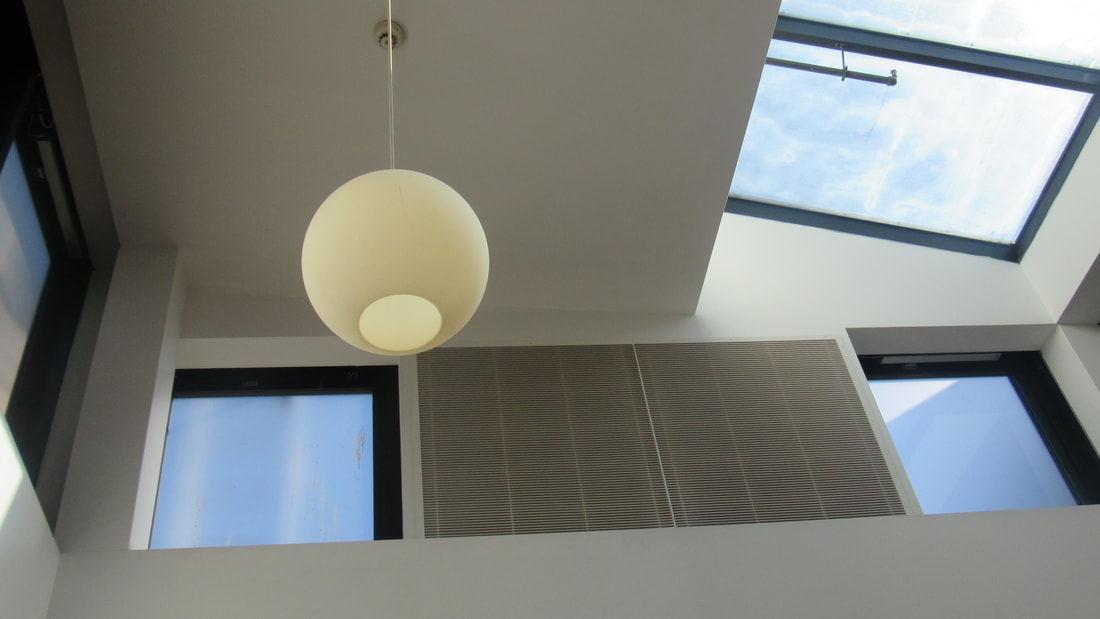
Uta Bart ...And of time
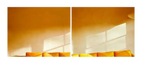
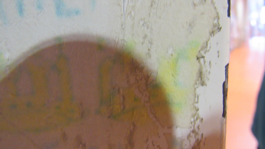
I chose to do this picture by Uta Barth as the theme of photographs I have chosen was openings, it's interesting however as not only the pictures that Barth takes not only include openings but they are also heavily influenced by light, where its coming from, its intensity and the shapes it makes in the background and in this case it created the shadow of a window. Usually windows are associated as a way of looking out into the world through a transparent without having to actually go outside, which in a way is a restriction but a way for us to see the world, however in this image our ability to look outside and see the world has been taken away deliberately and instead a copy of this window is what is shown and this allows us to wonder what is outside. Our idea of what could be through the window could also be influenced through the colors of the room, as in the sofa and the wall but also the light can influence what we imagine to be outside. The color orange is usually associated with joy, warmth and somewhat creativity so we can imagine that what is outside is possibly beauty. The use of the colors and the light is an opening for our imagination to sprout ideas of what is outside without having to look through the actual opening, the window. Furthermore I found the use of light interesting as every picture that is taken is through an opening that lets in light. When the camera opens light is allowed to come in and create the image and this is allowed to happen as the aperture of the camera is opened which is interesting because not only did the image already include light and openings as does every picture that has ever been taken, this image includes it twice which again creates an opening to thought and wonder.
making connections
Week 1 -
I have created images that link and are connected to the images of Uta Barth using different colours creating different moods and feelings and I want to connect it to the idea of Lucio Fontana's work. My idea is getting two images and make cuts into one of them and putting another image under it, joining two artist ideas creating one. Ive only done research on three artists and because of this im not sure if its enough or not, however I have already started making connections to creating work so I might do some more research to see what other ideas sprout.
My best refined idea so far is creating the duo tones based on openings and Uta Barth however I want to in a way mix Barth's image ideas and Fontana's ideas to create my own pictures making it not only an opening in the picture but an opening physically as the cuts in the pictures are physical openings.
Week 2 -
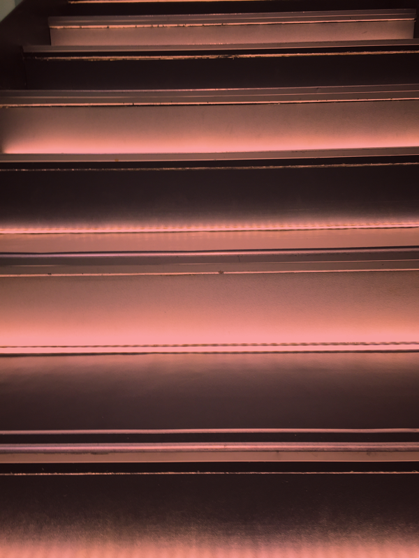
Black & Red duotones that will be cut and will go on top of the Black & White images
Black & Red duotones that will be cut and will go on top of the Black & White images


To make the duotones I had to take pictures that were quite light and had bright lights so the detail of the actual image would be visible, however making this pictures were really easy to do as i took them on my phone and edited them on an app also on my phone.
Black & White images that will go under duotones
All the black images will go through the openings of the red pictures that will be on top so you get a slight glimpse of whats beneath.
Week 3 -
After printing all the red and black images I then got 3 people to do what they wanted with the pictures and I wasn't allowed to tell them what to do and what not to do allowing them to be as creative or destructive as they wanted to creating 3 very different yet similar images. Similar because they were all made in the same way using the same things. I set up tools for the people to do what they wanted like sharpies, scissors but they were also allowed to fold, rip and stick onto the pictures creating a completely different image. Because of all the cuts and rips in all of them it created openings allowing the Black & White images allowed to be visible underneath. I think with the other 3 pictures I'm going to try to do something different instead of letting other people do what they want with the pictures.
After printing all the red and black images I then got 3 people to do what they wanted with the pictures and I wasn't allowed to tell them what to do and what not to do allowing them to be as creative or destructive as they wanted to creating 3 very different yet similar images. Similar because they were all made in the same way using the same things. I set up tools for the people to do what they wanted like sharpies, scissors but they were also allowed to fold, rip and stick onto the pictures creating a completely different image. Because of all the cuts and rips in all of them it created openings allowing the Black & White images allowed to be visible underneath. I think with the other 3 pictures I'm going to try to do something different instead of letting other people do what they want with the pictures.


Week 4 -
I am planning on instead of letting other people do what they wanted with my pictures, this time I'm the one changing them. I am planning on possibly getting the pictures on canvas like Lucio Fontana and making cuts on them and add writing, however I'm not sure yet.
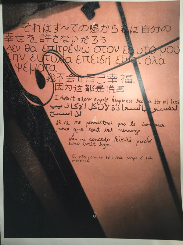
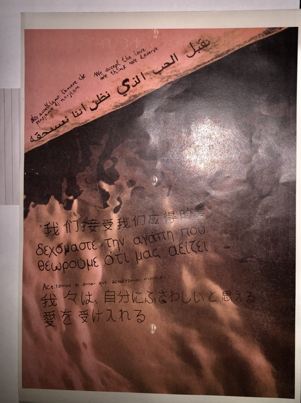
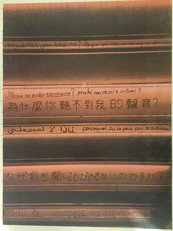
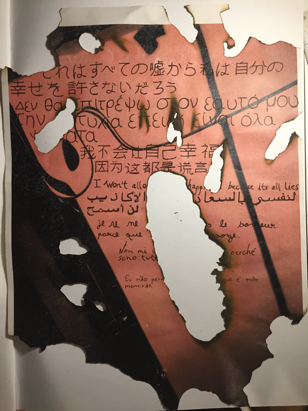
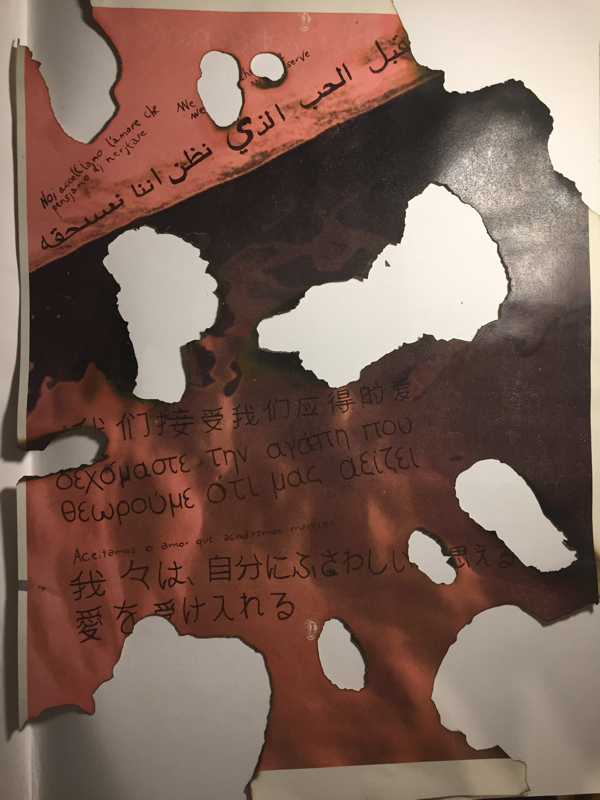
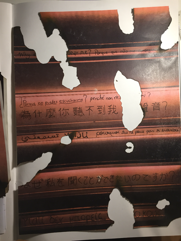
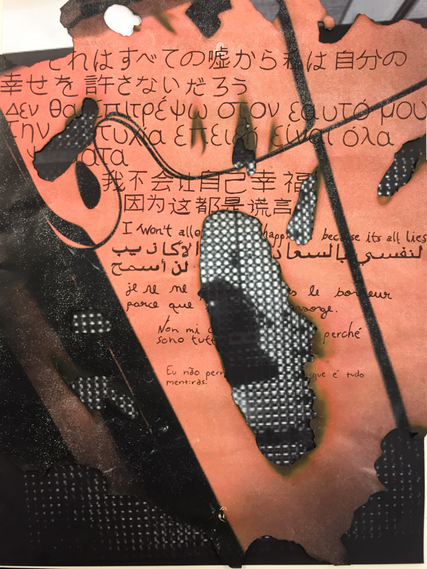
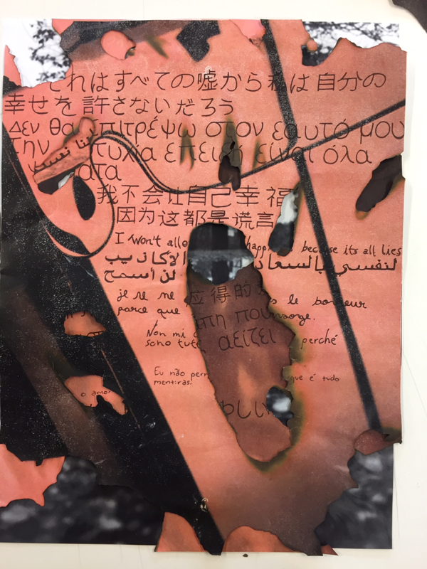
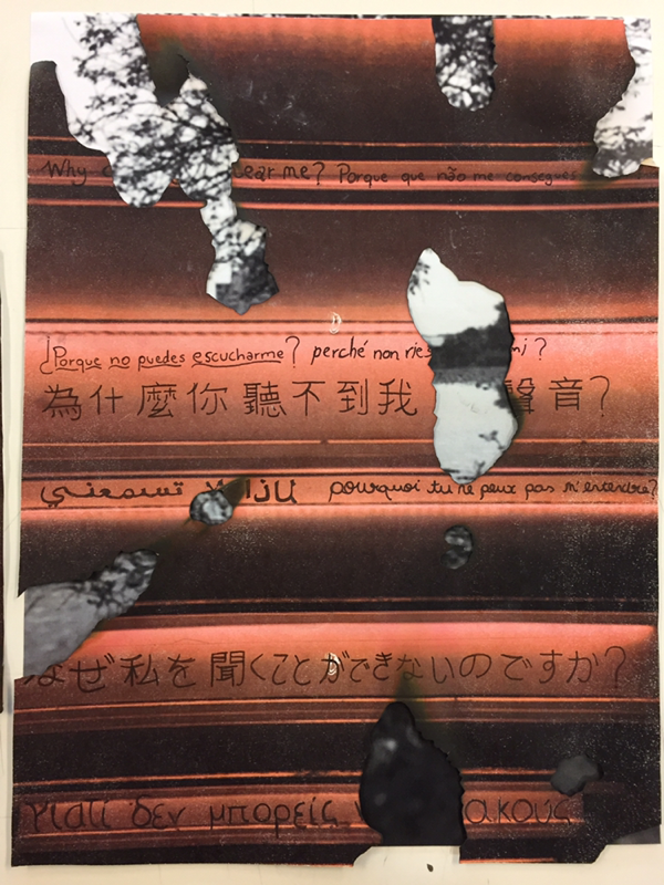
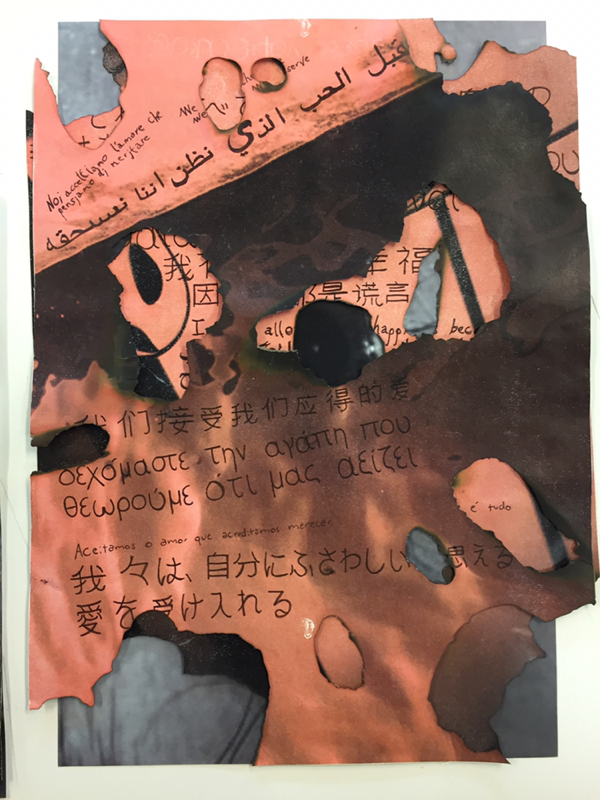
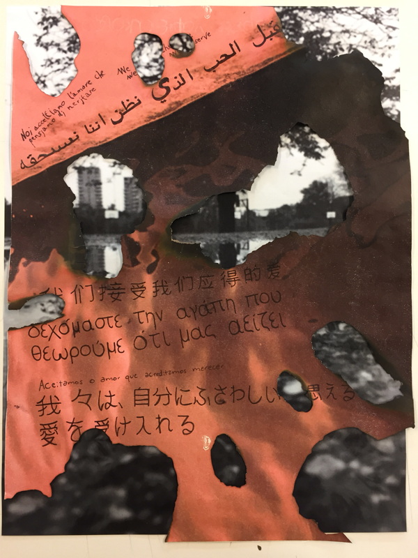
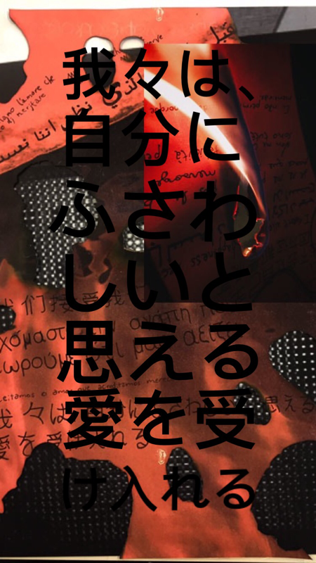
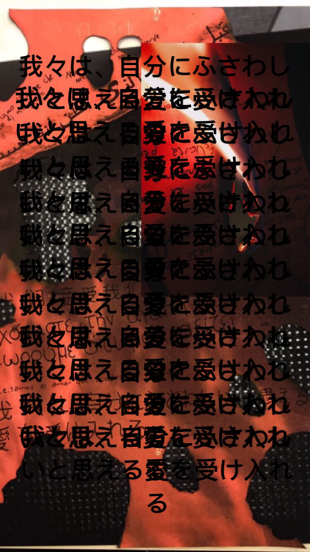
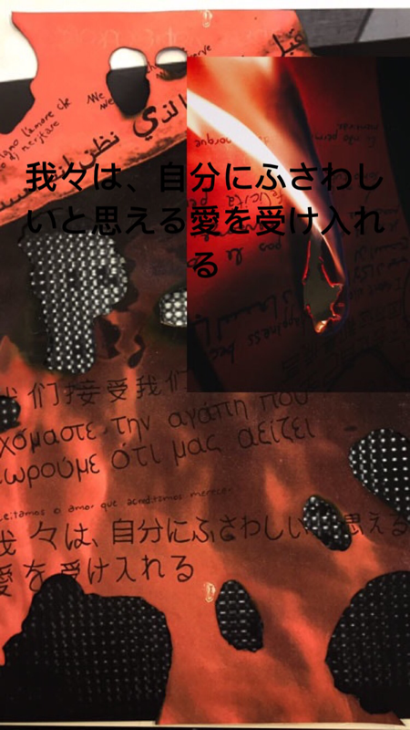
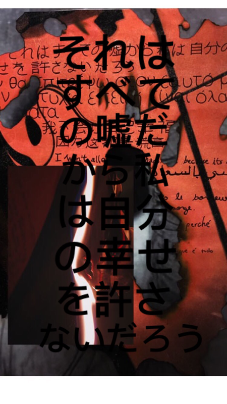
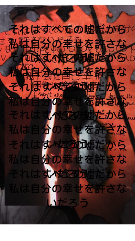
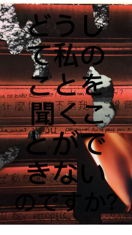
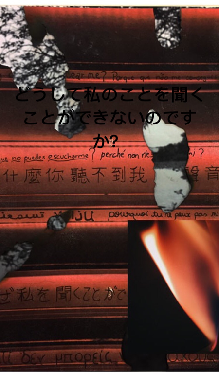
I decided to take the three pictures that were untouched home to do further experimentation with them and I really like how they all turned out. I got the three images and I wrote three different quotes on them that have relation to what has happened to me in the past and how I am feeling not only with myself but with the people around me and the world in itself. The three quotes all have meaning to me, and to make them have a deeper connection with me I handwrote the quote multiple times in various different languages like, Japanese, Greek, Italian, Mandarin, Arabic, French, English, Spanish and Portuguese as it is my first language.I wrote the quote in various different languages because I would love to be able to travel the world eventually. The quotes and the meanings behind them and the languages are like an opening into my mind.
I am planning on instead of letting other people do what they wanted with my pictures, this time I'm the one changing them. I am planning on possibly getting the pictures on canvas like Lucio Fontana and making cuts on them and add writing, however I'm not sure yet.
I decided to take the three pictures that were untouched home to do further experimentation with them and I really like how they all turned out. I got the three images and I wrote three different quotes on them that have relation to what has happened to me in the past and how I am feeling not only with myself but with the people around me and the world in itself. The three quotes all have meaning to me, and to make them have a deeper connection with me I handwrote the quote multiple times in various different languages like, Japanese, Greek, Italian, Mandarin, Arabic, French, English, Spanish and Portuguese as it is my first language.I wrote the quote in various different languages because I would love to be able to travel the world eventually. The quotes and the meanings behind them and the languages are like an opening into my mind.

Week 5 -
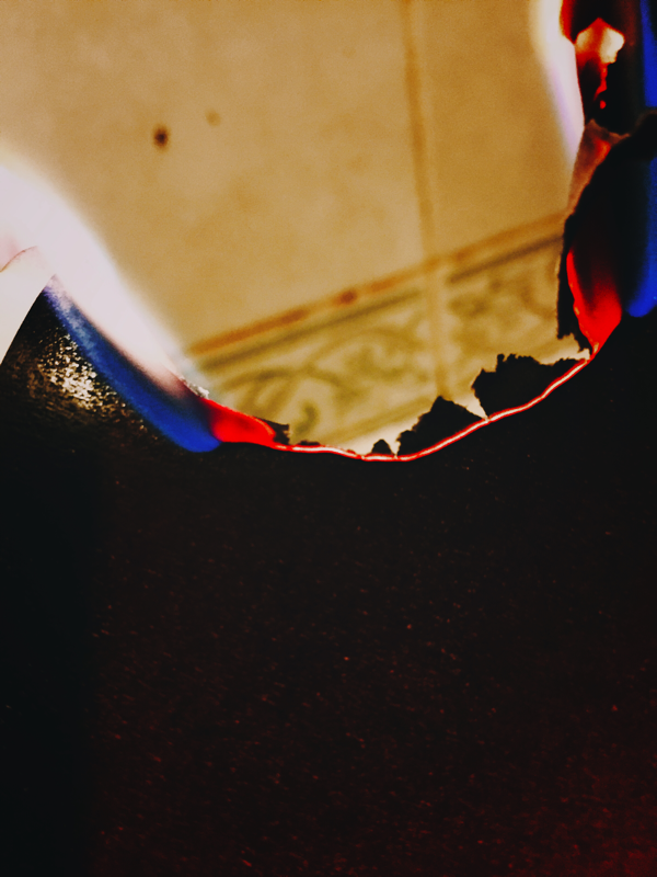
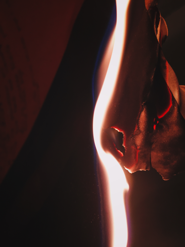
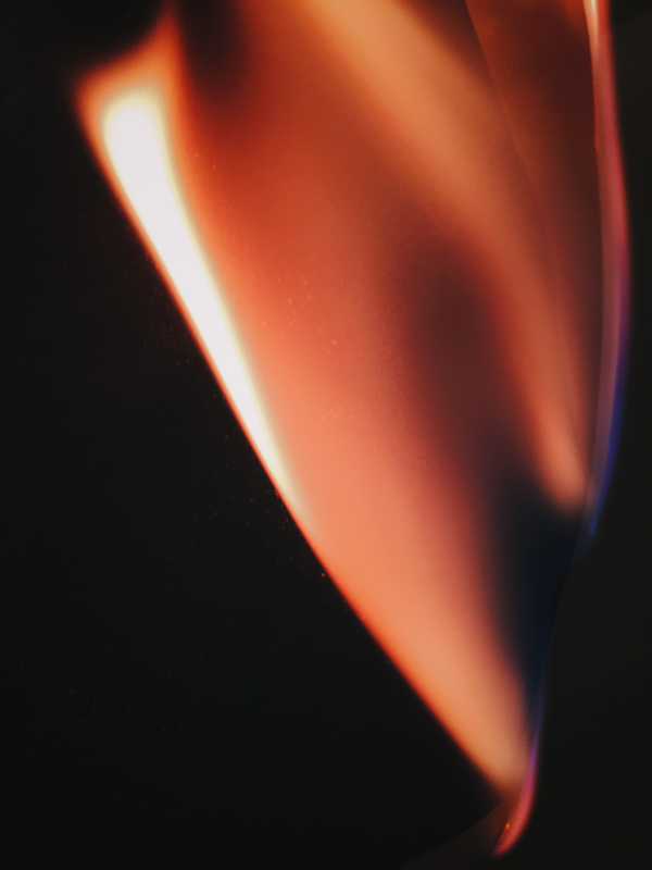
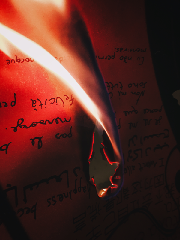
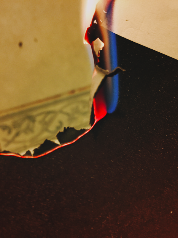
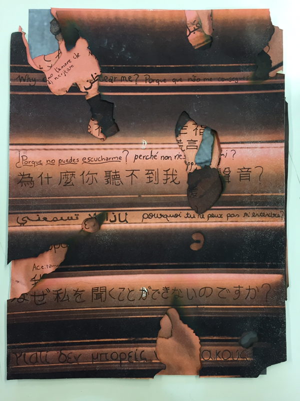
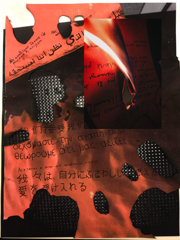
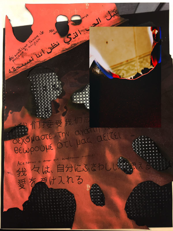
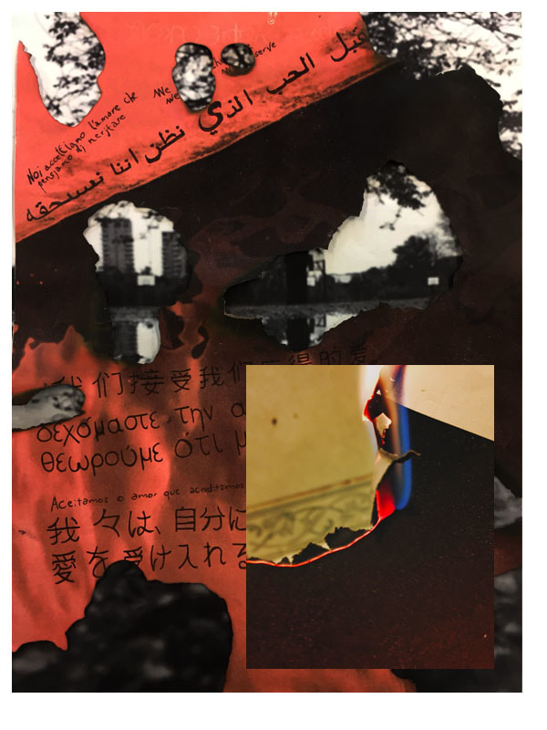
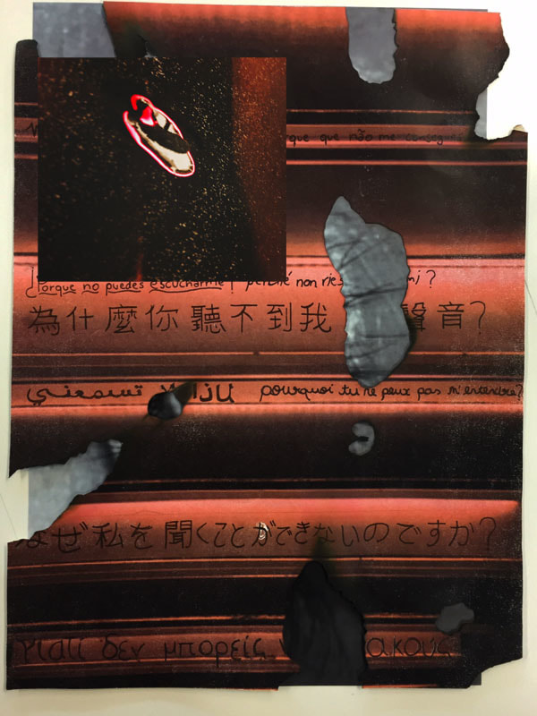
To further explore and understand the concept of openings I decided to burn the images in different areas of them to create a sense of inspiration taken from Lucio Fontana, instead of making cuts to create openings I made burns. The burns can also be associated with forgetting the past and what has happened, burning/destroying the quotes and creating an opening for something new in the future, which will be the images that I will place behind these ones. While burning the images I also managed to get some nice pictures, here are my favorites.
To further explore and understand the concept of openings I decided to burn the images in different areas of them to create a sense of inspiration taken from Lucio Fontana, instead of making cuts to create openings I made burns. The burns can also be associated with forgetting the past and what has happened, burning/destroying the quotes and creating an opening for something new in the future, which will be the images that I will place behind these ones. While burning the images I also managed to get some nice pictures, here are my favorites.
Week 6 -
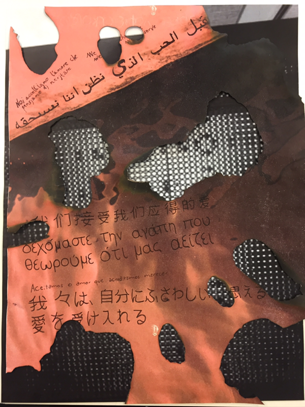
I began to layer all the different red images over each other in different ways to see how they would look and I tried changing the backgrounds, the black images, to see if they would have a different effect or if they would just look better than the originals, and some of them did. Some of the images looked much better with other backgrounds however the stacked images in my opinion don't look as good. I decided to continue with this idea and not he first one, which was allowing others to do what they wanted to my images as I prefer creating, changing and editing my own pieces as I can do what I want with them allowing me to express myself and create the work that I want and the work I think looks good. The other idea didn't give me as much freedom.
I began to layer all the different red images over each other in different ways to see how they would look and I tried changing the backgrounds, the black images, to see if they would have a different effect or if they would just look better than the originals, and some of them did. Some of the images looked much better with other backgrounds however the stacked images in my opinion don't look as good. I decided to continue with this idea and not he first one, which was allowing others to do what they wanted to my images as I prefer creating, changing and editing my own pieces as I can do what I want with them allowing me to express myself and create the work that I want and the work I think looks good. The other idea didn't give me as much freedom.
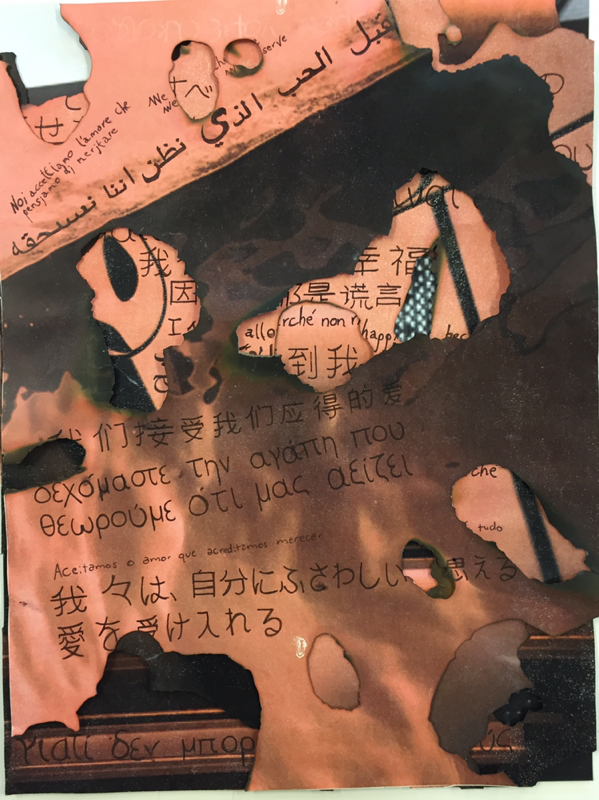
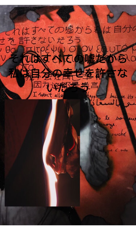
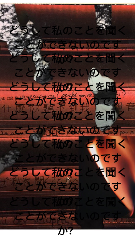
After choosing the best looking few I then took the images of the process during me burning he pictures and put them on top the already burnt outcome with the black and white images under as I had already distorted and changed the images physically, so I decided to do work on them digitally. I also made the images darker and have more contrast so the red would be slightly stronger and brighter and the black, darker, to make the red pop and be more visible.
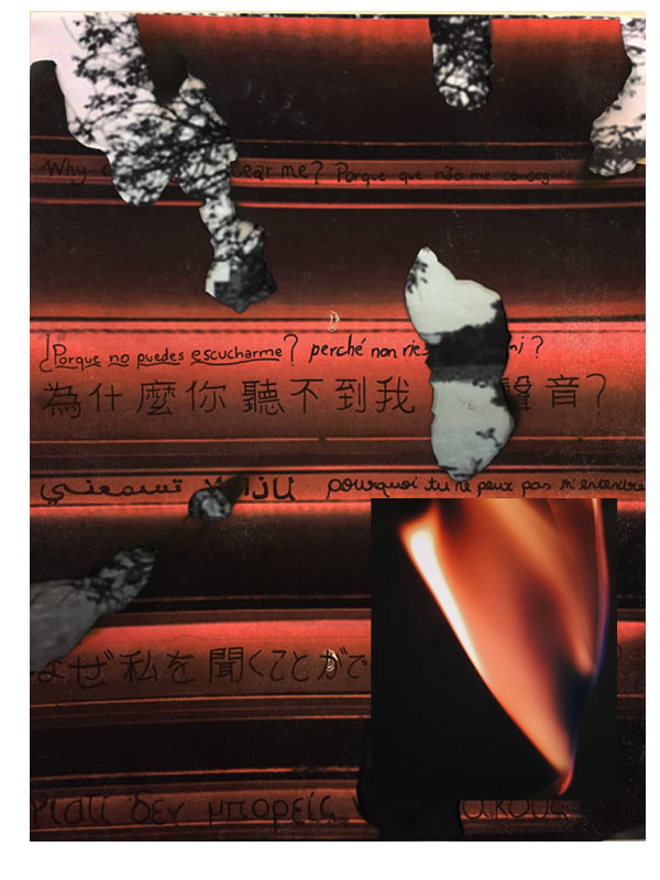
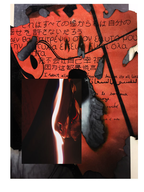
To then further digitally manipulate and modify the images I took my favorite language of the few I picked and used the writing to make it interesting and further explore how I can change an image digitally. I enlarged, overlaid and just added the quote again but in Japanese. The reason it is Japanese it's because I would love to be able to travel to all the countries I translated the quote to, however Japan would be my favorite one to go to, however you could say that the reason I overlaid and enlarged the writing is because, again, it links back to my past and constant growth of thoughts and thinking that just never really stops and is uncontrollable. Out of all of them I really like how the images with the enlarged writing look, I think they are the most successful ones and definitely came out the best.
Week 7 -
I decided to take digital manipulation further by making a video including my images and other recorded images. I tried making it disturbing and uncomfortable to watch and slightly intriguing so even though its disturbing people will carry on watching. The very disturbing aspect of the video comes from three main things. The blood, the sound and the colours used but the more effective ones being the sound and the colours as it is very loud and slightly annoying and the colours that are used are mostly red. I think the colour red is effective as it symbolises various things. Red is the colour of extremes. It's the colour of, violence, danger, anger, and adventure. Our prehistoric ancestors saw red as the colour of fire and blood, and most of reds symbolism today arises from its powerful associations in the past, again linking with my idea of things that have happened in the past, and gives off a very aggressive vibe. The idea of the past also links to the fact that the video starts and ends with a flame which could link to the idea of the beginning and the end of the world. I also used short clips of a cartoon in the video of a shark which is contrasting to the real shark that is also in the vide, it's like a comparison of reality and imagination, and of course reality is more aggressive and violent than the cartoon which is why I made the video red to show the violence of the real world. I also made the original images bright red to make them very visible so people don't miss them.
I decided to take digital manipulation further by making a video including my images and other recorded images. I tried making it disturbing and uncomfortable to watch and slightly intriguing so even though its disturbing people will carry on watching. The very disturbing aspect of the video comes from three main things. The blood, the sound and the colours used but the more effective ones being the sound and the colours as it is very loud and slightly annoying and the colours that are used are mostly red. I think the colour red is effective as it symbolises various things. Red is the colour of extremes. It's the colour of, violence, danger, anger, and adventure. Our prehistoric ancestors saw red as the colour of fire and blood, and most of reds symbolism today arises from its powerful associations in the past, again linking with my idea of things that have happened in the past, and gives off a very aggressive vibe. The idea of the past also links to the fact that the video starts and ends with a flame which could link to the idea of the beginning and the end of the world. I also used short clips of a cartoon in the video of a shark which is contrasting to the real shark that is also in the vide, it's like a comparison of reality and imagination, and of course reality is more aggressive and violent than the cartoon which is why I made the video red to show the violence of the real world. I also made the original images bright red to make them very visible so people don't miss them.
Week 8 -
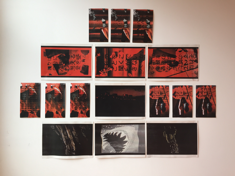
I then from the video took a few screenshots of my favourite parts with the best looking images and put them all on the wall along with the original images with the Japanese writing next to the others. I am also going to project the video with the images around it as a type of frame for the video while it plays. I want the room where the video will be projected mostly pitch black so the people watching will be easily emerged in it.
I then from the video took a few screenshots of my favourite parts with the best looking images and put them all on the wall along with the original images with the Japanese writing next to the others. I am also going to project the video with the images around it as a type of frame for the video while it plays. I want the room where the video will be projected mostly pitch black so the people watching will be easily emerged in it.
FINAL EVALUATION
I didn't have time to complete my project to the extent I wanted to, which was to take the final piece (the video) and make it into something physical by bringing it into the real world by projecting around the pictures that I took of the video itself. There is a reason behind every single choice I made during this project, even if it was a negative or positive event that occurred or it was how I was feeling at the time, however everything has meaning. For example, the quotes, I got the three images and I wrote three different quotes on them that have a relation to what has happened to me in the past and how I am feeling not only towards myself but also towards the people around me and the world itself. The three quotes all have meaning to me, and to make them have a deeper connection with me I hand wrote the quotes multiple times in various different languages like, Japanese, Greek, Italian, Mandarin, Arabic, French, English, Spanish and Portuguese as it is my first language. I wrote the quotes in various different languages as I would love to be able to travel the world eventually. The quotes and the meanings behind them and the languages are like an opening into my mind. Furthermore for me during the whole project to be able to further understand the concept of openings, which again, shows every decision I made had a reason for it, I decided to burn the images in different areas of them to create a sense of inspiration taken from Lucio Fontana, who was the artist I was looking into that physically changed his images by cutting into them, however, instead of making cuts to create openings I burn the paper. The holes made by the burns can also be associated with forgetting the past and what has happened by destroying, in this case, burning the past to allow an opening for something new in the future, which is symbolized by he images that I placed behind the red ones. The reason I decided o continue this idea of me editing my images in the way I wanted to was because the first idea allowed others to do what they wanted to my images, however I prefer creating, changing and editing my own pieces as I can do what I want with them allowing me o express myself and put my mind in the work and create work that I want and think looks good, the other idea deprived me too much of my freedom in creating. I then decided to further digitally manipulate and modify the images I took my favorite language of the few I already had picked and used the writing to further explore how I can further digitally manipulate my work as physically manipulating and changing it I already had done. I enlarged, overlaid and added the quote multiple times. The reason I picked to go with Japanese mainly was because it would be my favorite country to go visit. In addition and enlarged the writing is because it can potentially show growth from what I learnt from these specific words and the growth is presented by the overlaying and the enlargements of the quotes themselves. Furthermore you could also argue that the reason I overlaid and enlarged the writing was because, again, links back to my past and instead of growth as a person it represents the constant growth of thoughts and thinking that never really stops and is uncontrollable. I then for the final experimentation decided to take digital manipulation further by making a video including my images and other footage I recorded my images and other footage I recorded. I tried making it purposely disturbing and uncomfortable to watch and slightly intriguing at the same time so even tough its disturbing people will want to carry on watching. The very disturbing aspect of the video comes from three main things, the blood, the sound and the colours used but the more effective ones being the sound and the colours as it is very loud and slighly annoying and the colours that are used are mostly red. I think the colour red as i symbolizes various things. Red is the colour of extremes. It's the colour of, violence, danger, anger, and adventure. Our prehistoric ancestors saw red as the colour of fire and blood, and most of reds symbolism today arises from its powerful associations in the past, again linking with my idea of things that have happened in the past, and gives off a very aggressive vibe. The audio of the video is purposely loud and for me the audio in a way is connected to the idea of overflowing and overgrowing thoughts that are in their own way "loud" and potentially hard to ignore and irritating, just like the audio in the actual video, what is also interesting is how the video starts with barely any sound and then it gets louder and louder until it comes to a stop just like how the video starts with the flame but also ends with i which could link o the idea of the beginning and the end of the world, with fire and noise, linking back to the idea of the past and our ancestors and how they saw the colours that I chose. I also used short clips of a cartoon in the video of a shark which is contrasting to the real shark that is also in the video, it's like a comparison of reality and imagination, and of course reality is more aggressive and violent than the cartoon and how people wish everything would be which is why I made the video of the real shark red to show the violence of the real world. I also made the original images bright red to make them very visible so people dont miss them. With the video I tried to not only make it connect to me bu to connect it with the world and people which is why I used the real video of the shark, making it easier to also make others connect to the video in their own way like I managed to. The people that watch it are able to interpret i in anyway hey want and give the video the meaning or symbolism hey want as it can connote different thoughts.
